In this study, we collect and analyze historical exchange rate data for the 30 currencies listed in the table below, considering the US dollar as reference. Reuters is the source of the data and you can access it by downloading post29.xlsx file here.
| country | currency |
|---|---|
| Argentine | USDARS |
| Brazil | USDBRL |
| Bulgaria | USDBGN |
| Chile | USDCLP |
| Colombia | USDCOP |
| Czech Republic | USDCZK |
| Egypt | USDEGP |
| Hungary | USDHUF |
| India | USDINR |
| Indonesia | USDIDR |
| Kazakhstan | USDKZT |
| Kenya | USDKES |
| Malaysia | USDMYR |
| Mexico | USDMXN |
| Nigeria | USDNGN |
| Pakistan | USDPKR |
| Peru | USDPEN |
| Philippines | USDPHP |
| Poland | USDPLN |
| Romania | USDRON |
| Russia | USDRUB |
| Singapore | USDSGD |
| South Africa | USDZAR |
| South Korea | USDKRW |
| Sri Lanka | USDLKR |
| Taiwan | USDTWD |
| Thailand | USDTHB |
| Turkey | USDTRY |
| Ukranie | USDUAH |
| Vietnam | USDVND |
By calculating the average, we can convert the daily frequency data to monthly data.
df <- readxl::read_excel("data.xlsx") %>%
  na.omit() %>%
  pivot_longer(!DATE, names_to = "Vars", values_to = "Vals") %>%
  mutate(
    Months = format(DATE,"%m"),
    Years = format(DATE,"%Y")
  ) %>%
  group_by(Vars,Months,Years) %>%
  summarise(
    MeanVals = mean(Vals)
  ) %>%
  ungroup() %>%
  arrange(Vars,Years) %>%
  mutate(
    DATE = as.Date(paste0(Years,"-",Months,"-",1))
  ) %>%
  select(DATE,Vars,MeanVals) %>%
  pivot_wider(names_from = "Vars", values_from = "MeanVals")
It would be better if we standardize the data. The following formula can be used to standardize the values in a dataset.
\(z = \frac{(x - \mu)}{\sigma}\)
\(z\): Standardised value or Z-score
\(x\): Original value
\(\mu\): Sample mean
\(\sigma\): Sample standard deviation
df_standardize %>%
  pivot_longer(!DATE, names_to = "Vars", values_to = "Vals") %>%
  ggplot(aes(x = DATE, y = Vals)) +
  geom_line() +
  facet_wrap(~Vars, ncol = 5) +
  theme_minimal() +
  theme(axis.title = element_blank(),
        axis.text.x = element_text(size = 15),
        axis.text.y = element_blank(),
        strip.text = element_text(size = 20))
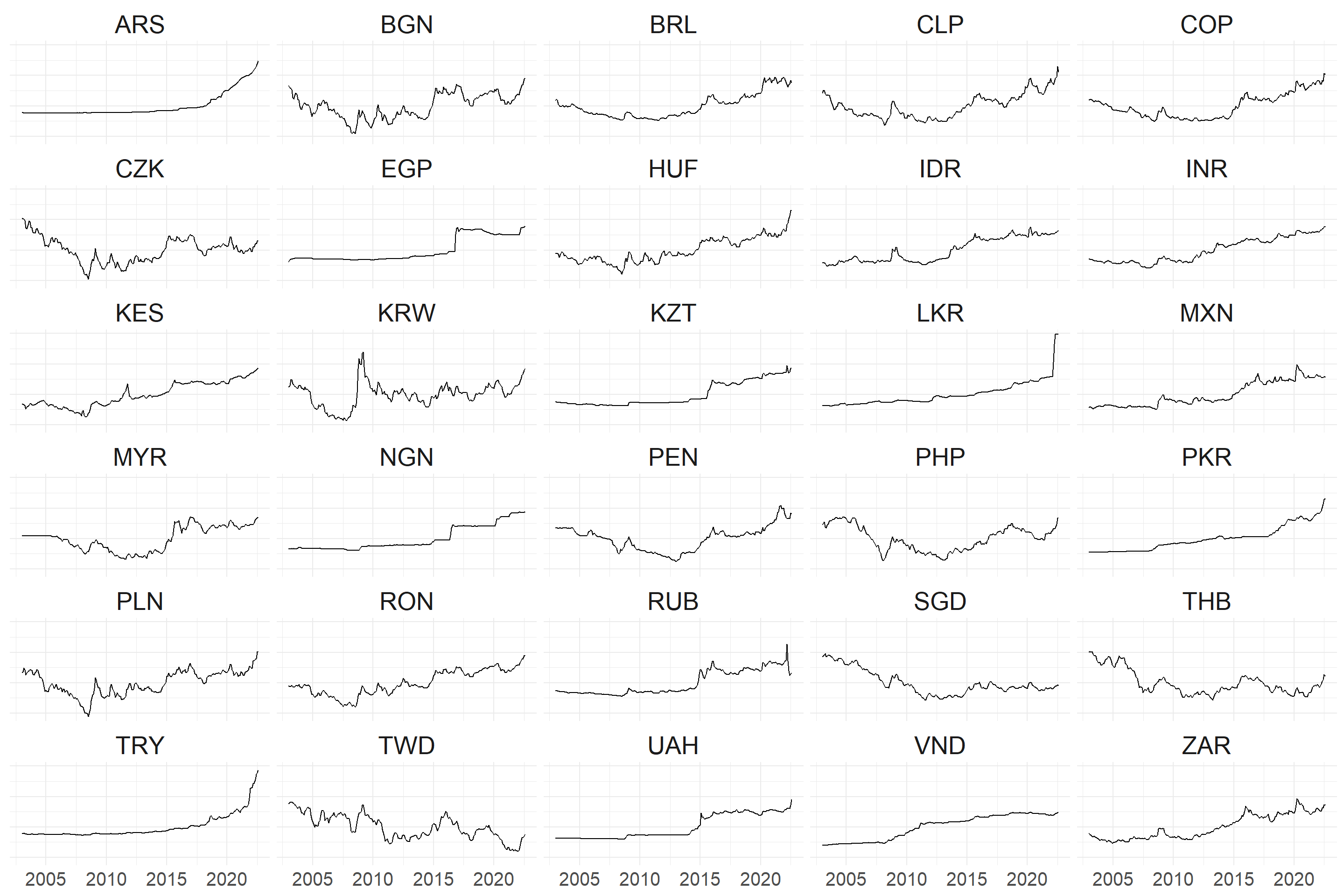
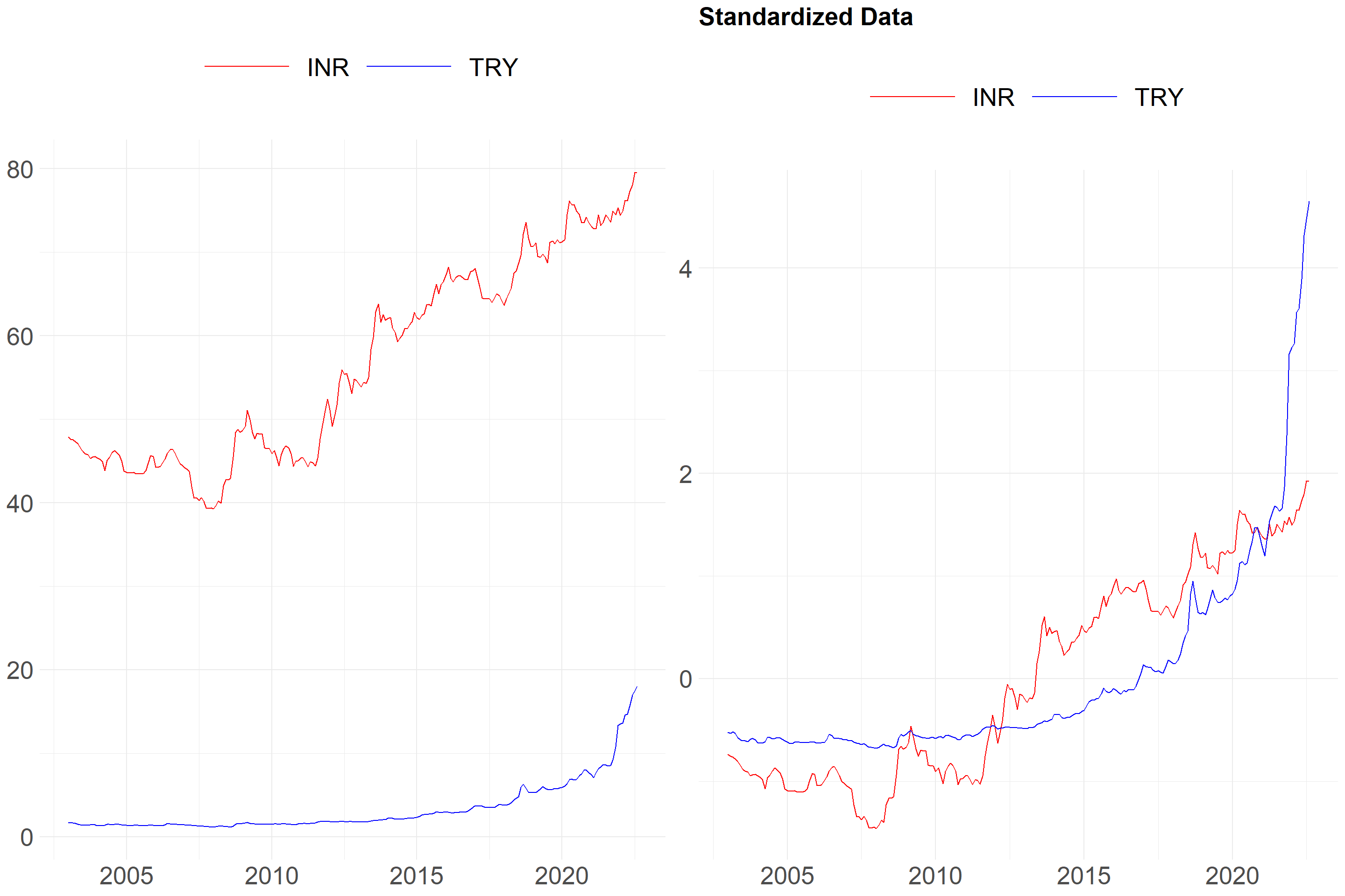
What happens when the data is standardised? An example is provided below. I’d like to draw your attention to the y-axis.
Type: h or Hierarchical
An algorithm called hierarchical clustering divides objects into clusters based on how similar they are. The result is a collection of clusters, each of which differs from the others while having things that are generally similar to one another.
Distance: dtw or Dynamic Time Warping
We can explain DTW by comparing it to the Euclidean distance. The distance between two points in Euclidean space is known as the Euclidean distance.
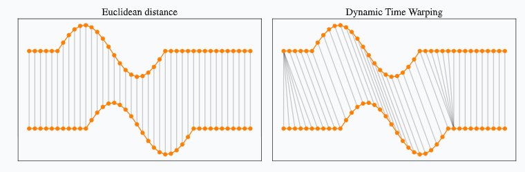
Figure 1: https://rtavenar.github.io/blog/dtw.html
Dynamic Time Warping uses temporal distortions to create the best possible alignment, whereas Euclidean only allows one-to-one point comparison.
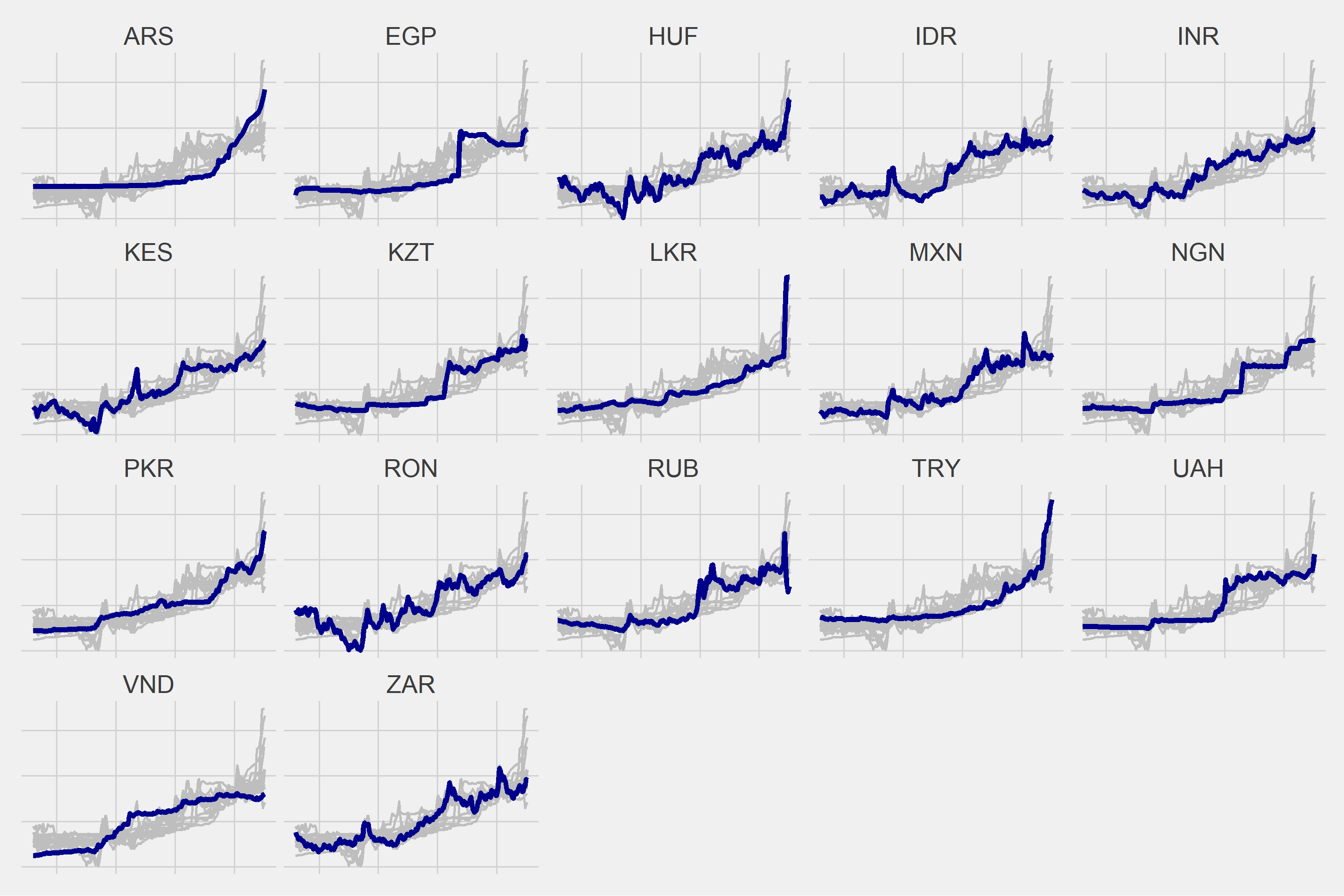
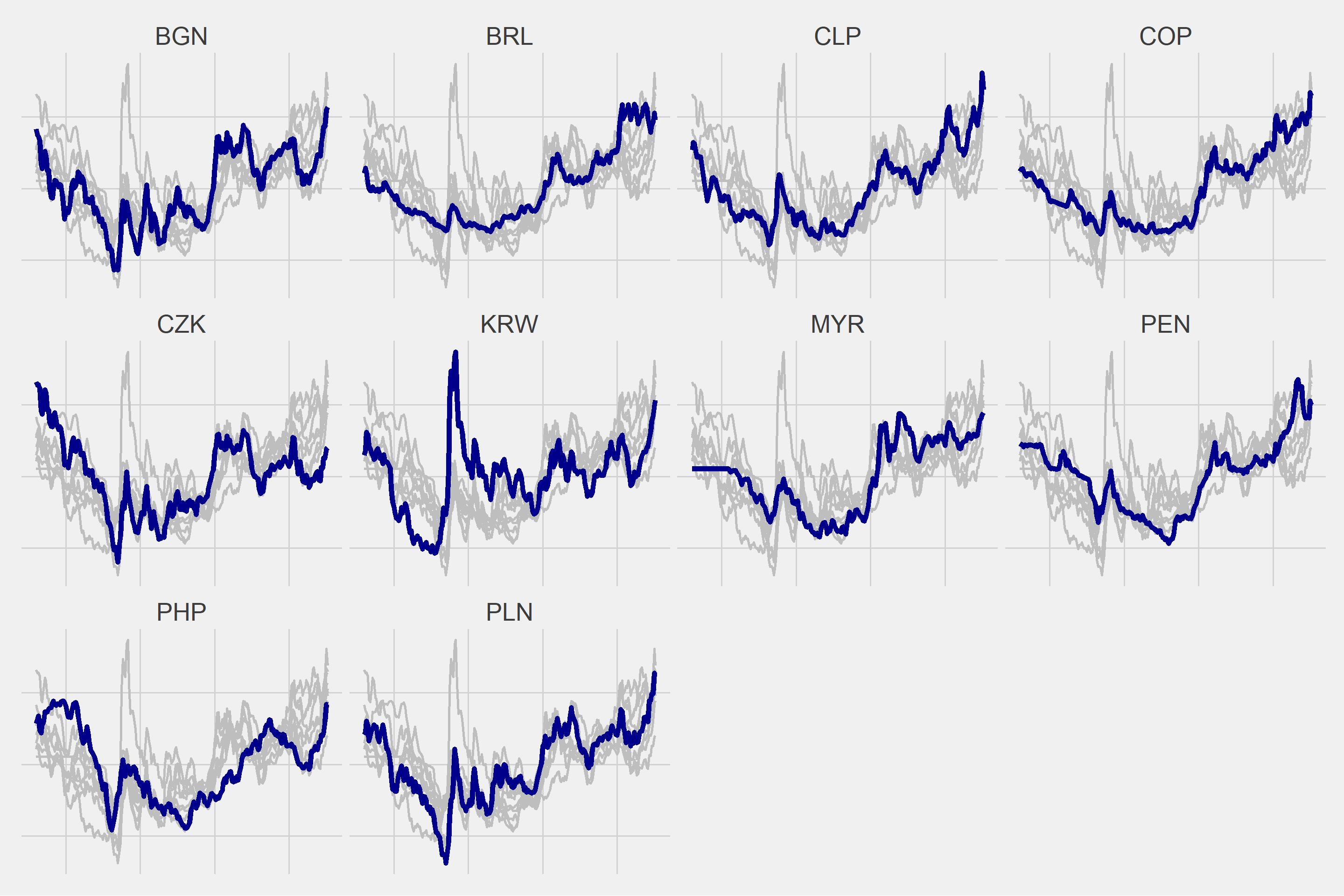
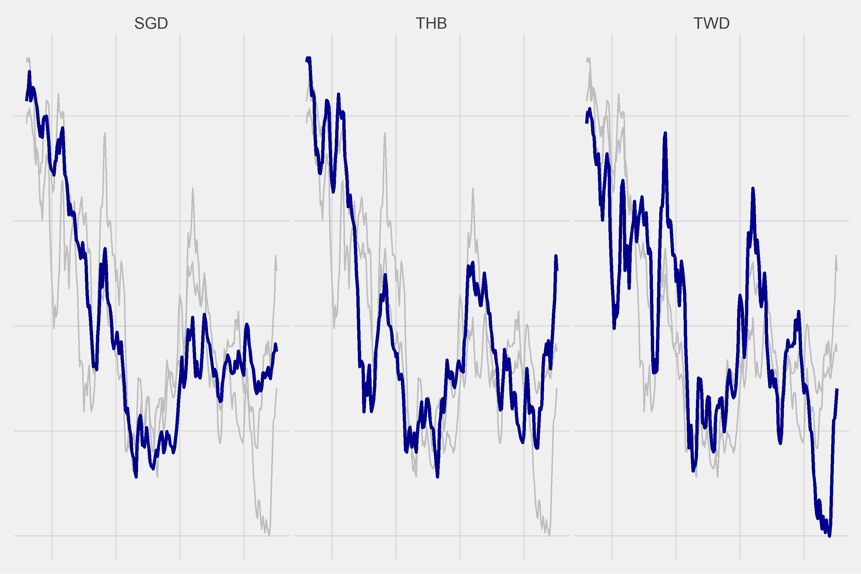
As a result of various trials, I decided to create 3 different clusters.
k <- 3L

data_cluster <- tsclust(
  t(df_standardize[,-1]), # data
  type = "h", # What type of clustering method to use
  k = k, # Number of desired clusters
  distance = "dtw" # Dynamic time warping
)
cluster <- as.data.frame(cutree(data_cluster, k=k)) %>%
  rownames_to_column(., var = "Vars") %>%
  rename("Cluster"=2)
| Vars | Cluster |
|---|---|
| ARS | 1 |
| EGP | 1 |
| HUF | 1 |
| IDR | 1 |
| INR | 1 |
| KES | 1 |
| KZT | 1 |
| LKR | 1 |
| MXN | 1 |
| NGN | 1 |
| PKR | 1 |
| RON | 1 |
| RUB | 1 |
| TRY | 1 |
| UAH | 1 |
| VND | 1 |
| ZAR | 1 |
| BGN | 2 |
| BRL | 2 |
| CLP | 2 |
| COP | 2 |
| CZK | 2 |
| KRW | 2 |
| MYR | 2 |
| PEN | 2 |
| PHP | 2 |
| PLN | 2 |
| SGD | 3 |
| THB | 3 |
| TWD | 3 |
for(i in 1:length(unique(cluster$Cluster))){

  g <- ggplot(df2 %>% filter(Cluster == i), aes(x = DATE, y = Vals)) +
    geom_line(data = df2 %>% filter(Cluster == i) %>% rename(Vars2 = Vars), aes(group = Vars2), color = "gray", size = 1) +
    geom_line(color = "dark blue", size = 2) +
    ggthemes::theme_fivethirtyeight() +
    theme(strip.text = element_text(size = 20),
          axis.text = element_blank()) +
    facet_wrap(~Vars)

  plot(g)

}