You can compare variables over time using animated bar charts by following the bars as if you were betting on a single one.
Let’s create a static graph first, and then one that is dynamic, to compare the two.
Follow the steps below to access the data, or click here to download the post28.xlsx file.
https://www.tuik.gov.tr/ (The English language option is available in the upper right corner)
Statistics/Transportation and Communication
Databases/Road Motor Vehicle Statistics
The number of road motor vehicles registered to the traffic/Type of Vehicle&Brand
Cars&All, respectively.
Monthly (All), Region (Turkey)
df <- readxl::read_excel("data.xlsx") %>%
  select(-1) %>%
  slice(-c(1:3)) %>%
  `colnames<-`(paste0("C",seq(1,ncol(.),1))) %>%
  mutate(
    C1 = unlist(lapply(str_extract_all(C1, "\\([^()]+\\)"), "[[", 1)),
    C1 = gsub("[()]", "", C1),
    C1 = zoo::na.locf(C1)
  ) %>%
  pivot_longer(!c(C1,C2), names_to = "month", values_to = "value") %>%
  mutate(
    month = case_when(
      month == "C3" ~ "01",
      month == "C4" ~ "02",
      month == "C5" ~ "03",
      month == "C6" ~ "04",
      month == "C7" ~ "05",
      month == "C8" ~ "06",
      month == "C9" ~ "07",
      month == "C10" ~ "08",
      month == "C11" ~ "09",
      month == "C12" ~ "10",
      month == "C13" ~ "11",
      month == "C14" ~ "12",
    )
  ) %>%
  mutate(
    date = as.Date(paste0(C2,"-",month,"-",1)),
    value = as.numeric(value)
  ) %>%
  rename("brand"="C1") %>%
  select(date,brand,value) %>%
  filter(date <= as.Date("2022-07-01")) %>%
  mutate(value = ifelse(is.na(value), 0, value),
         brand = ifelse(brand == "Diger","Others",brand))
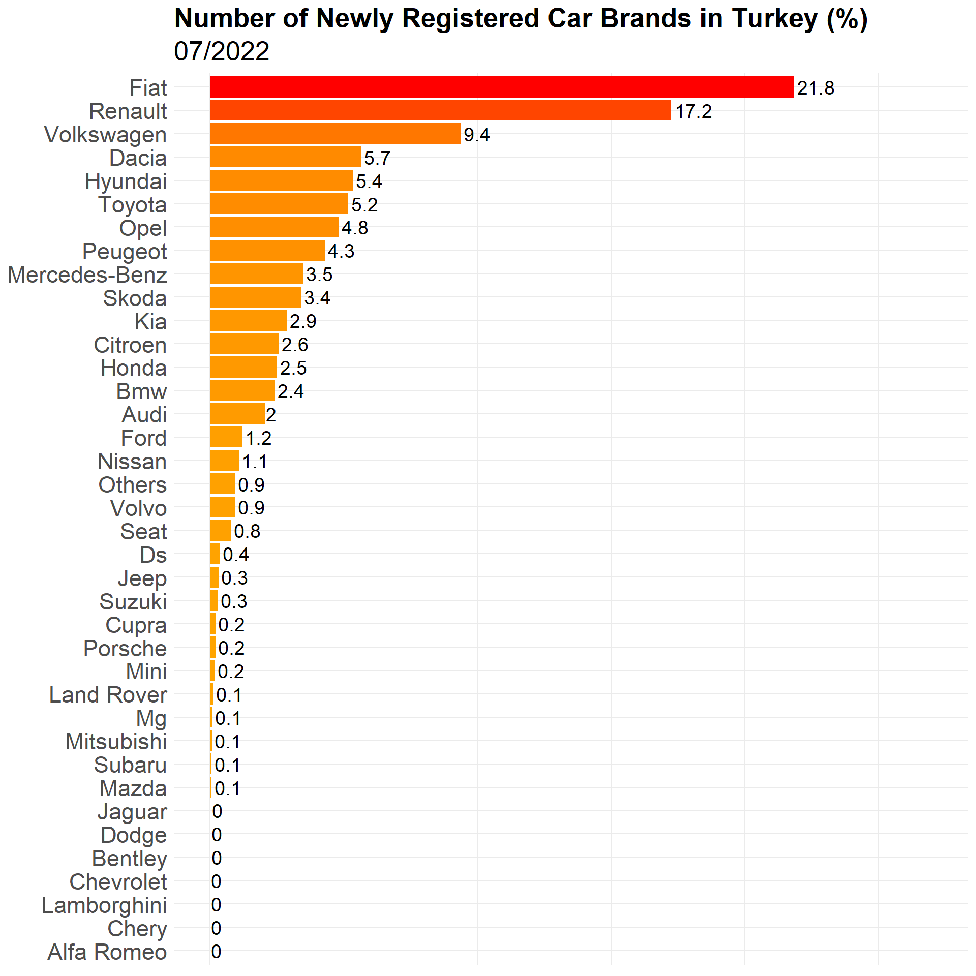
There are 49 different car brands.
Static plot:
ggplot(df_filtered %>% filter(date == as.Date("2022-07-01")),
       aes(x = reorder(brand,p), y = p, fill = p)) +
  geom_col() +
  geom_text(aes(label = round(p,digits = 1)), hjust = -0.1, size = 5) +
  coord_flip() +
  theme_minimal() +
  theme(legend.position = "none",
        axis.title = element_blank(),
        axis.text.y = element_text(size = 17),
        axis.text.x = element_blank(),
        plot.title = element_text(size = 20, face = "bold"),
        plot.subtitle = element_text(size = 20)) +
  scale_fill_gradient(low = "orange", high = "red") +
  scale_y_continuous(limits = c(0,max(df_filtered$p)+1)) +
  labs(
    title = "Number of Newly Registered Car Brands in Turkey (%)",
    subtitle = "07/2022"
  )
Now it’s time to set the animation up.
df_rank <- df_filtered %>%
  arrange(date,desc(p)) %>%
  group_by(date) %>%
  mutate(rank = row_number(),
         date = format(date,"%Y/%m"),
         p = round(p, digits = 1))

anim <- ggplot(df_rank, aes(x = rank, y = p, fill = p)) +
  geom_col() +
  geom_text(aes(y = 0, label = paste0(brand," ")), hjust = 1) +
  geom_text(aes(y = p, label = p), hjust = -0.1) +
  coord_flip(expand = TRUE) +
  theme_minimal() +
  theme(legend.position = "none",
        axis.title = element_blank(),
        axis.text = element_blank(),
        plot.title = element_text(size = 20, face = "bold"),
        plot.subtitle = element_text(size = 20)) +
  scale_fill_gradient(low = "orange", high = "red") +
  scale_x_reverse() +
  labs(
    title = "Number of Newly Registered Car Brands in Turkey (%)",
    subtitle = "{closest_state}"
  ) +
  transition_states(date) +
  view_follow()

animate(
  anim,
  223,
  fps = 40,
  duration = 50,
  width = 1800,
  height = 1000,
  renderer = gifski_renderer("gganim.gif")
)
