Line charts with shadows let one feel in control. I’ll use the weekly death statistics from Istanbul to illustrate what I mean.
The data can be accessed by downloading the post25.xlsx file here or visiting this site.
Let’s see the lines before adding a shadow.
df %>%
  pivot_longer(!week, names_to = "years", values_to = "values") %>%
  ggplot(aes(x = week, y = values, group = years, color = years)) +
  geom_line() +
  ggthemes::theme_fivethirtyeight() +
  theme(axis.text = element_text(size = 20),
        strip.text = element_text(size = 20),
        legend.title = element_blank(),
        legend.text = element_text(size = 20),
        legend.key.size = unit(1, 'cm'))

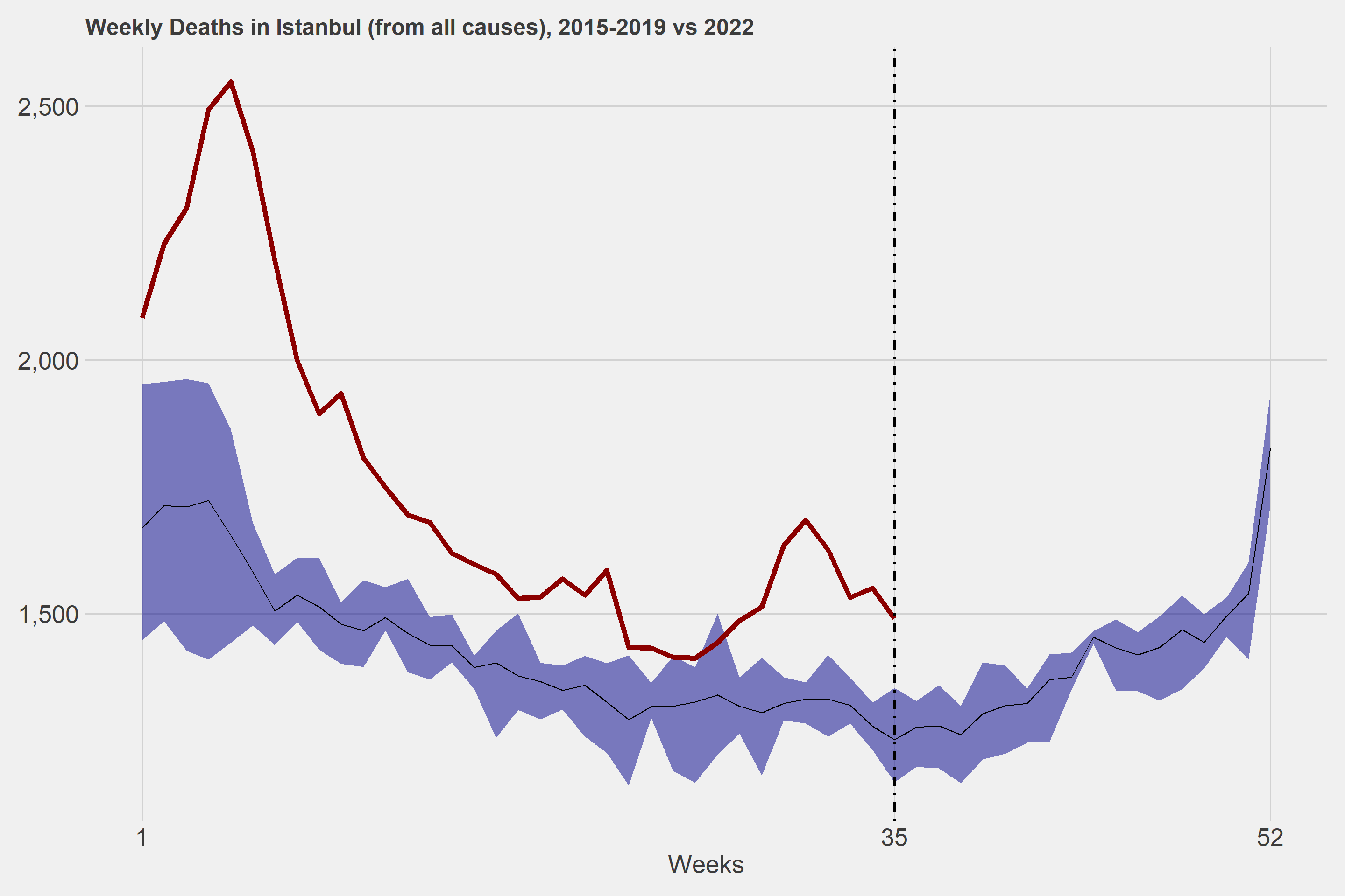
First, we’ll create a ribbon by determining the minimum and maximum values by week from deaths between 2015 and 2019.
The following things are easier after the above step. We can add shadowed areas to our lines using geom_ribbon().
lastWeek <- df2 %>%
  pull(y2022) %>%
  na.omit() %>%
  length(.)

ggplot(df2, aes(x = week)) +
  geom_ribbon(
    aes(
      ymin = normal_min,
      ymax = normal_max
    ),
    fill = "dark blue",
    alpha = .5
  ) +
  geom_line(aes(y = normal_mean)) +
  geom_line(aes(y = y2022), color = "dark red", size = 2) +
  geom_vline(xintercept = lastWeek, linetype = "dotdash", size = 1) +
  ggthemes::theme_fivethirtyeight() +
  theme(axis.text = element_text(size = 20),
        axis.title.x = element_text(size = 20)) +
  scale_x_continuous(breaks = c(1,lastWeek,52)) +
  scale_y_continuous(labels = scales::comma) +
  labs(
    title = "Weekly Deaths in Istanbul (from all causes), 2015-2019 vs 2022",
    x = "Weeks"
  )