Borsa Istanbul calculates variety of indices to follow the movements of markets, to be an underlying asset for the financial products, and to be used as a benchmark for collective investment instruments. Click here for further information.
You can access the data by downloading post21.xlsx file on my GitHub account. The 12 BIST Indices were chosen by me. You can find all of BIST indices here. Reuters data is used.
library(tidyverse)

df <- readxl::read_excel("data.xlsx") %>%
  select(-DATE) %>%
  mutate_all(
    ., function(x) (lead(x)/x-1)*100
  ) %>%
na.omit()head(df)| XU030 | XU050 | XU100 | XUTUM | XBANK | XBLSM | XGIDA | XHOLD | XTRZM | XULAS | XUTEK | XUSIN |
|---|---|---|---|---|---|---|---|---|---|---|---|
| 0.51 | 0.53 | 0.67 | 0.65 | 0.85 | -0.22 | 0.03 | 1.02 | -0.01 | -1.03 | 0.29 | 1.02 |
| 0.91 | 0.88 | 0.95 | 0.97 | 2.58 | 0.97 | 1.35 | -0.04 | 2.61 | -0.01 | 0.74 | 0.98 |
| -0.09 | -0.02 | 0.14 | 0.25 | -0.36 | 0.68 | 1.07 | 0.13 | 1.93 | 1.55 | -0.20 | 0.20 |
| 0.30 | 0.33 | 0.34 | 0.41 | 0.48 | 0.96 | 0.16 | 0.94 | 0.81 | -0.01 | 0.56 | 0.32 |
| -0.88 | -0.75 | -0.71 | -0.49 | -0.55 | 0.35 | 0.29 | -0.76 | -0.66 | -0.11 | 0.09 | -0.36 |
| 0.36 | 0.36 | 0.41 | 0.47 | 0.97 | 0.68 | 0.63 | 0.41 | 0.70 | 0.78 | 0.32 | 0.44 |
Histogram and Density
If there are two variables:
df %>%
  filter(vars %in% c("XU100","XBANK")) %>%
  ggplot(aes(x = vals, fill = vars)) +
  geom_histogram(position = "identity", alpha = .5) +
  theme_minimal() +
  theme(axis.title = element_blank(),
        axis.text.y = element_blank(),
        legend.title = element_blank(),
        legend.position = "top") +
  scale_fill_manual(values = c("red","blue"))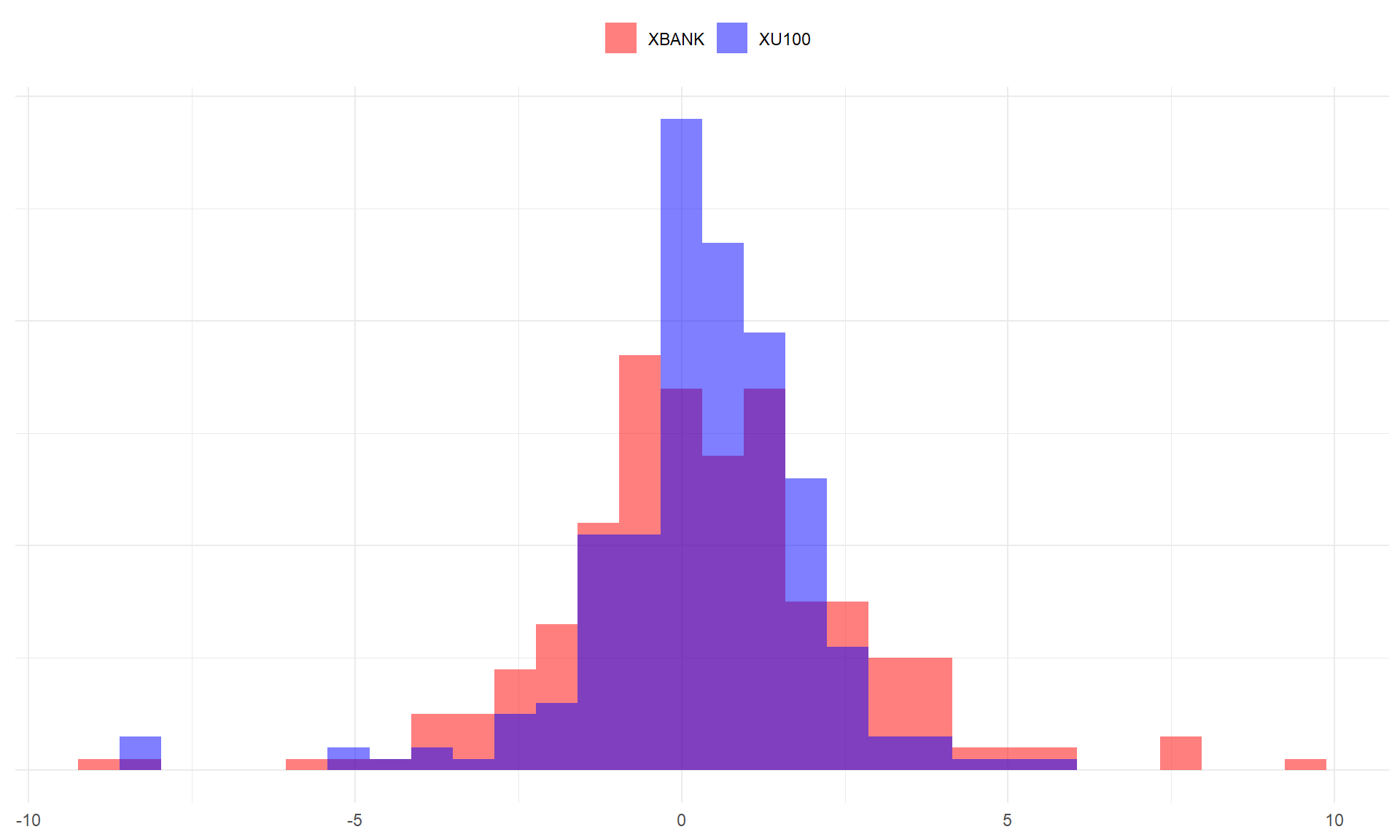
df %>%
  filter(vars %in% c("XU100","XBANK")) %>%
  ggplot(aes(x = vals, fill = vars)) +
  geom_density(alpha = .5) +
  theme_minimal() +
  theme(axis.title = element_blank(),
        axis.text.y = element_blank(),
        legend.title = element_blank(),
        legend.position = "top") +
  scale_fill_manual(values = c("red","blue"))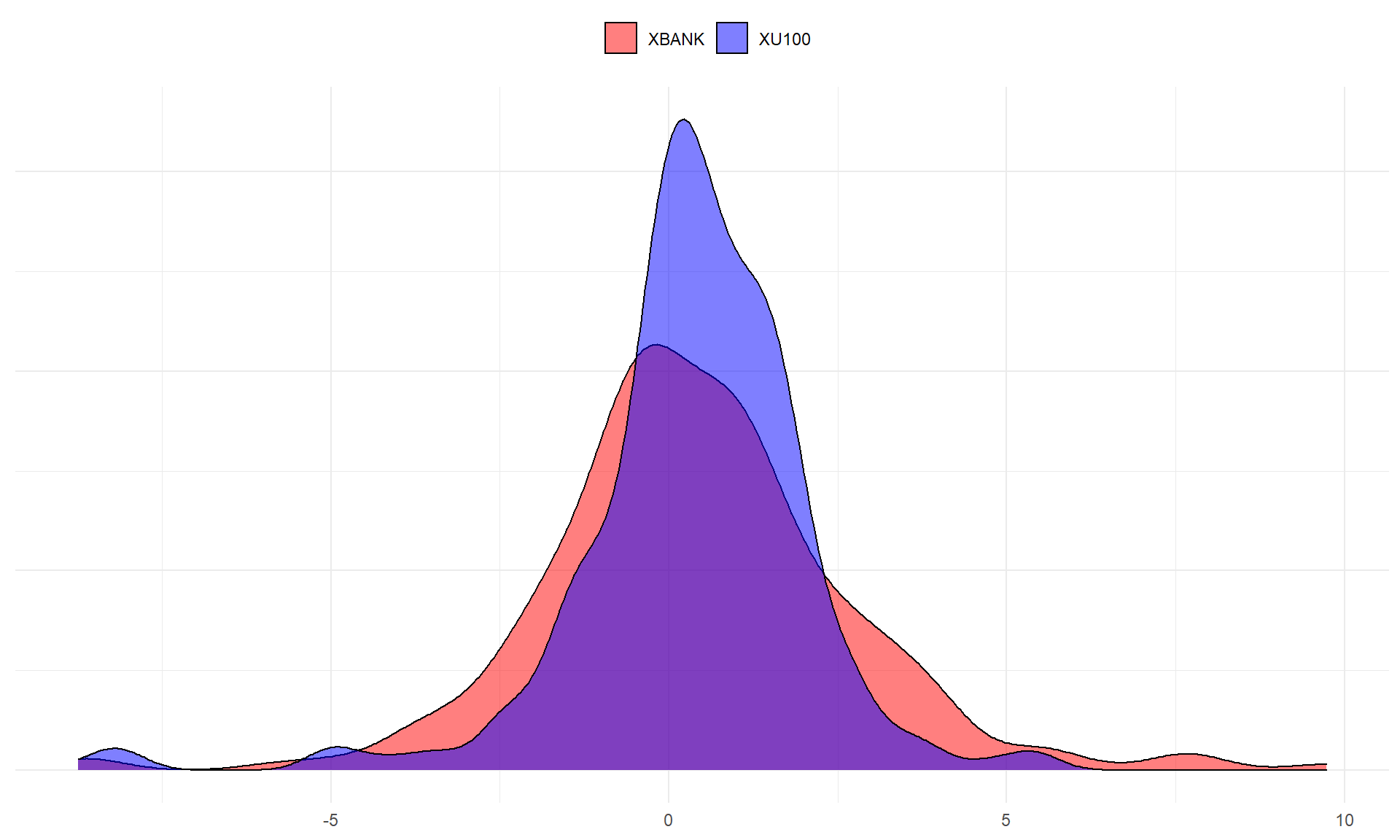
df %>%
  filter(vars %in% c("XU100","XBANK")) %>%
  pivot_wider(names_from = "vars", values_from = "vals") %>%
  ggplot(aes(x = vals)) +
  geom_histogram(aes(x = XU100, y = ..density..), fill = "red" ) +
  geom_label(aes(x = 4, y = 0.25, label = "XU100"), color = "red") +
  geom_histogram(aes(x = XBANK, y = -..density..), fill = "blue") +
  geom_label(aes(x = 4, y = -0.25, label = "XBANK"), color = "blue") +
  theme_minimal() +
  theme(axis.title = element_blank(),
        axis.text.y = element_blank())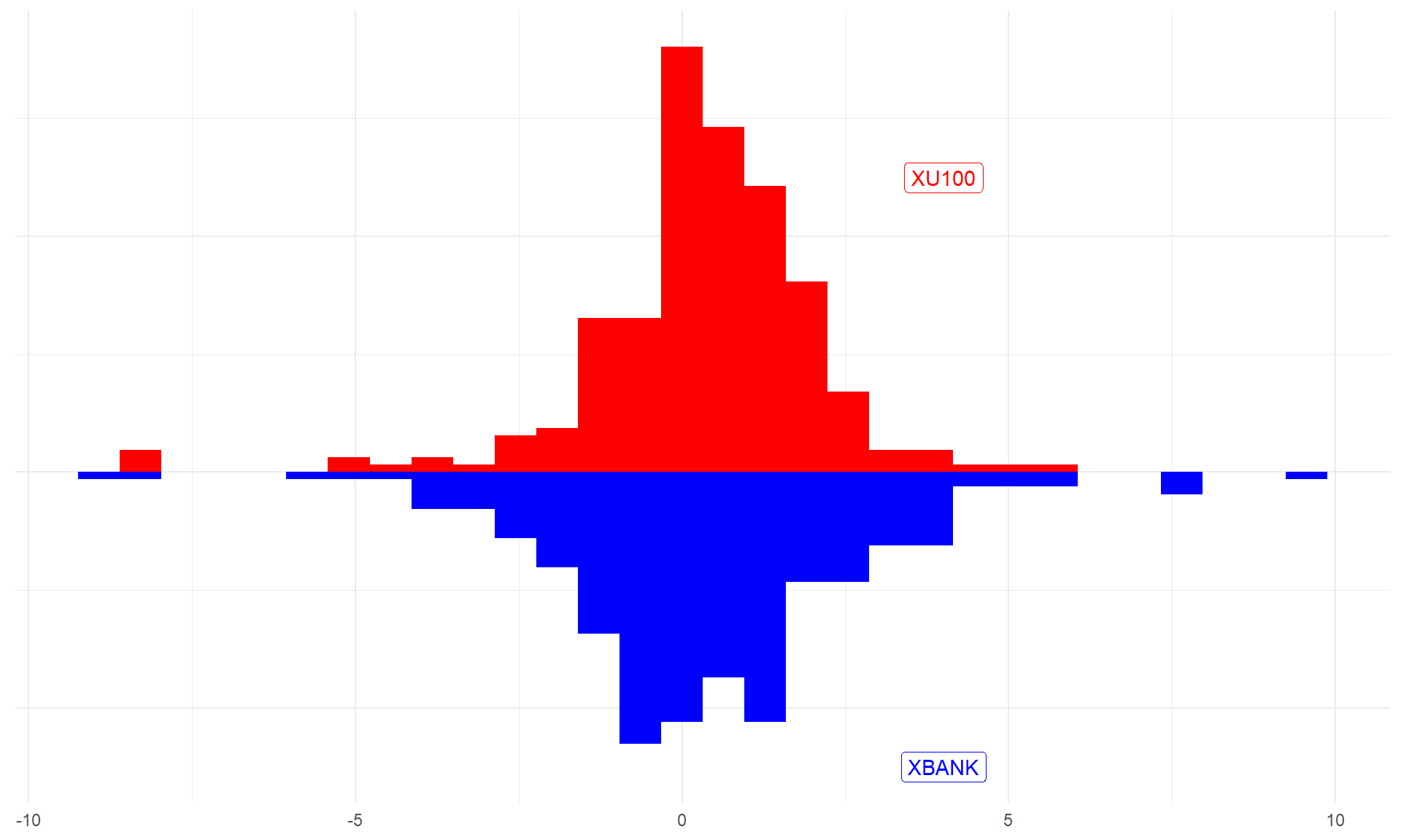
df %>%
  filter(vars %in% c("XU100","XBANK")) %>%
  pivot_wider(names_from = "vars", values_from = "vals") %>%
  ggplot(aes(x = vals)) +
  geom_density(aes(x = XU100, y = ..density..), fill = "red" ) +
  geom_label(aes(x=4, y=0.25, label = "XU100"), color="red") +
  geom_density(aes(x = XBANK, y = -..density..), fill = "blue") +
  geom_label(aes(x=4, y = -0.25, label = "XBANK"), color="blue") +
  theme_minimal() +
  theme(axis.title = element_blank(),
        axis.text.y = element_blank())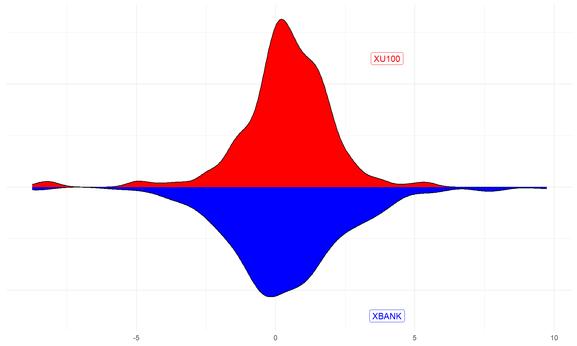
If there are more than two variables:
df %>%
  filter(vars %in% c("XU100","XBANK","XBLSM")) %>%
  ggplot(aes(x = vals, color = vars)) +
  geom_density(lwd = 1.5) +
  theme_minimal() +
  theme(axis.title = element_blank(),
        axis.text.y = element_blank(),
        legend.title = element_blank(),
        legend.position = "top")
df %>%
  ggplot(aes(x = vals, fill = vars)) +
  geom_histogram(position = "identity") +
  theme_minimal() +
  theme(axis.title = element_blank(),
        axis.text.y = element_blank(),
        legend.position = "none") +
  facet_wrap(~vars)
df %>%
  ggplot(aes(x = vals, fill = vars)) +
  geom_density() +
  theme_minimal() +
  theme(axis.title = element_blank(),
        axis.text.y = element_blank(),
        legend.position = "none") +
  facet_wrap(~vars)
Violin and Boxplot
df %>%
  ggplot(aes(x = vars, y = vals, fill = vars)) +
  geom_violin() +
  theme_minimal() +
  theme(axis.title = element_blank(),
        legend.position = "none")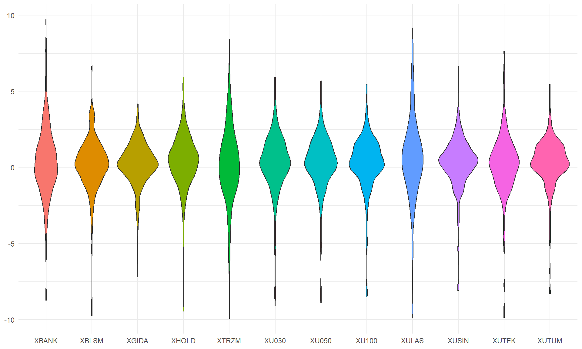
df %>%
  ggplot(aes(x = vars, y = vals, fill = vars)) +
  geom_violin() +
  theme_minimal() +
  theme(axis.title = element_blank(),
        legend.position = "none") +
  coord_flip()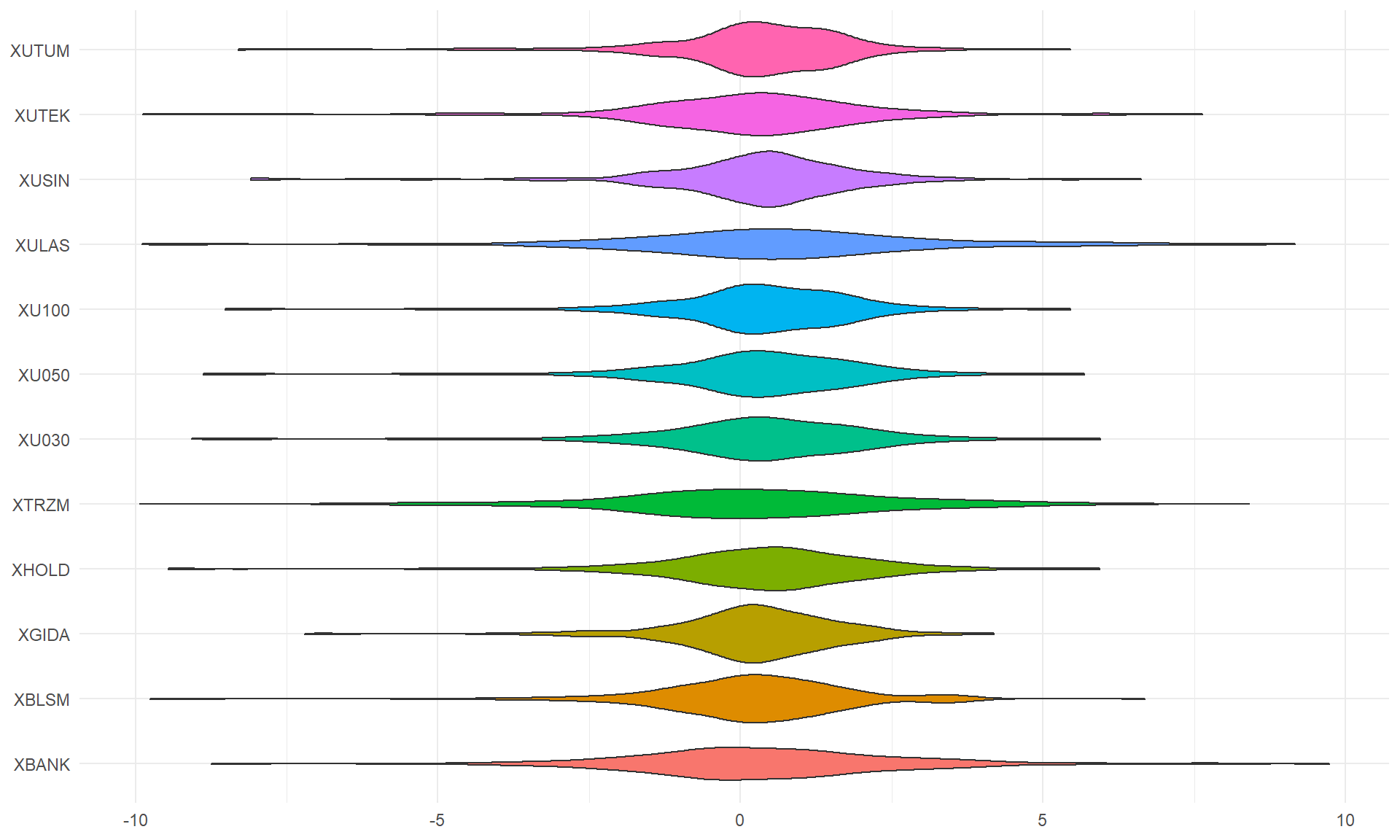
df %>%
  ggplot(aes(x = vars, y = vals, fill = vars)) +
  geom_boxplot() +
  theme_minimal() +
  theme(axis.title = element_blank(),
        legend.position = "none")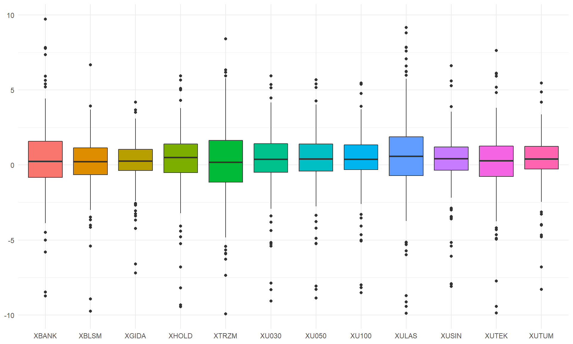
df %>%
  ggplot(aes(x = vars, y = vals, fill = vars)) +
  geom_boxplot() +
  theme_minimal() +
  theme(axis.title = element_blank(),
        legend.position = "none") +
  coord_flip()
df %>%
  ggplot(aes(x = vars, y = vals, fill = vars)) +
  geom_violin() +
  geom_boxplot(alpha = .5) +
  theme_minimal() +
  theme(axis.title = element_blank(),
        legend.position = "none")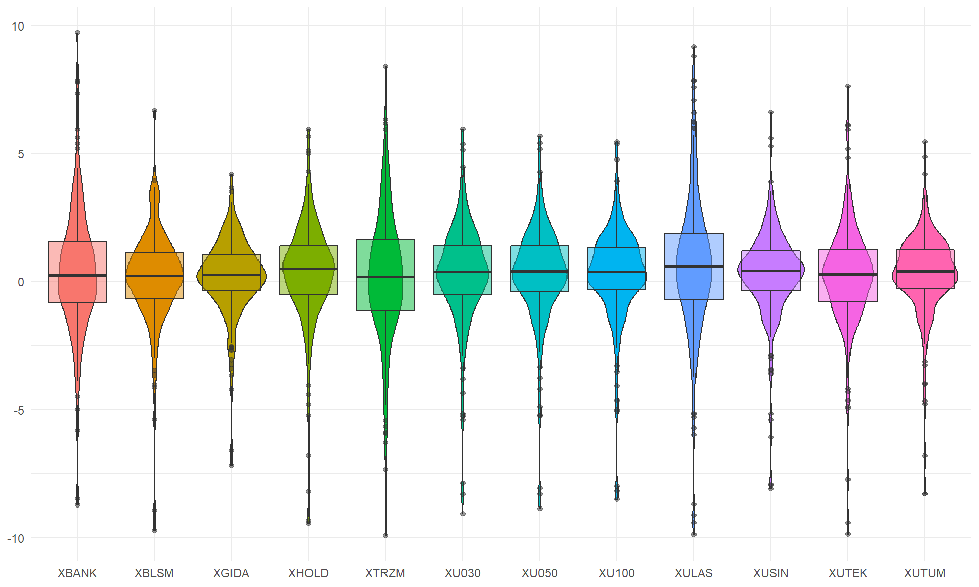
df %>%
  ggplot(aes(x = vars, y = vals, fill = vars)) +
  geom_violin() +
  geom_boxplot(alpha = .5) +
  theme_minimal() +
  theme(axis.title = element_blank(),
        legend.position = "none") +
  coord_flip()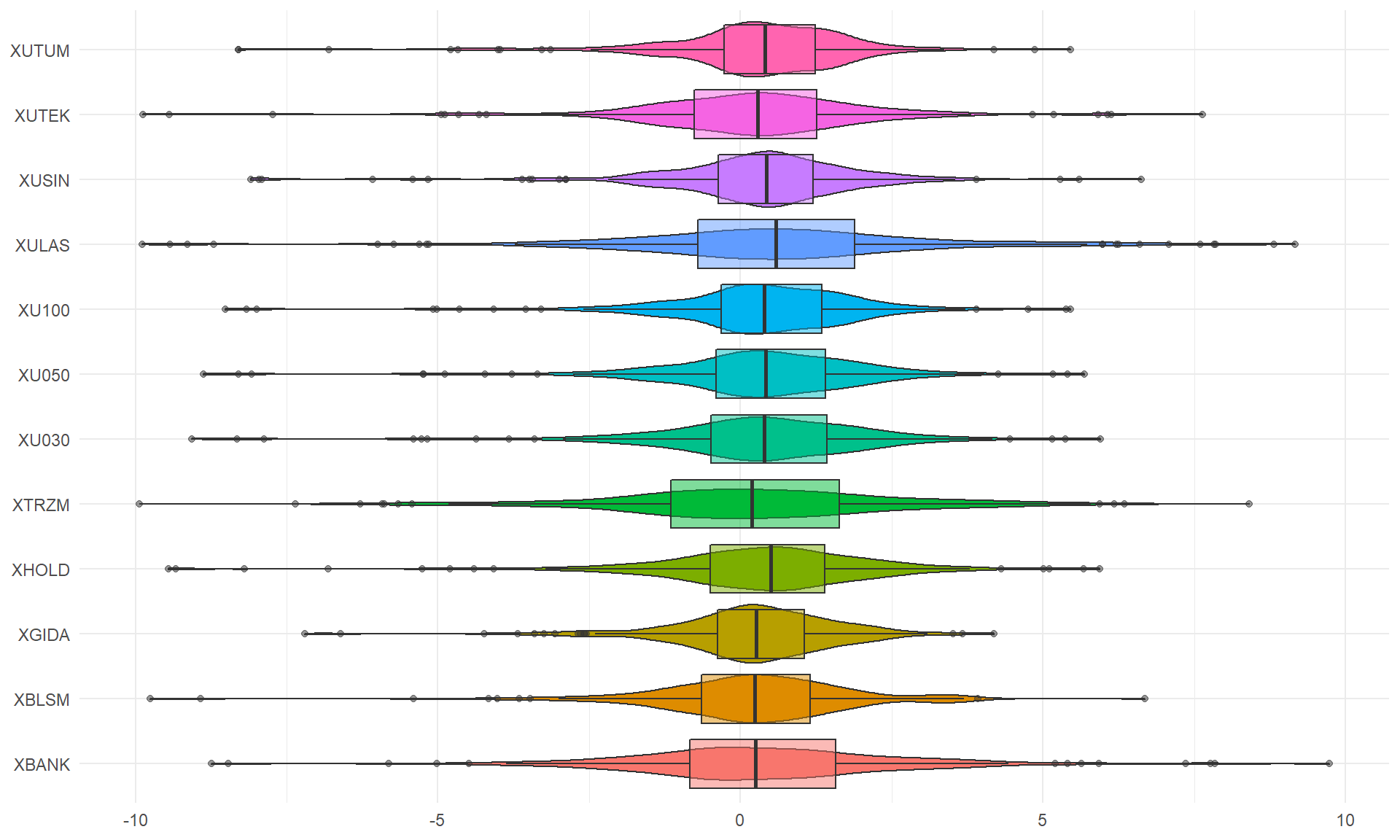
Ridgeline
df %>%
  ggplot(aes(x = vals, y = vars, fill = stat(x))) +
  geom_density_ridges_gradient(scale = 3) +
  geom_vline(xintercept = 0, linetype = "dashed") +
  scale_fill_viridis_c(option = "C") +
  theme_minimal() +
  theme(axis.title = element_blank(),
        legend.position = "none")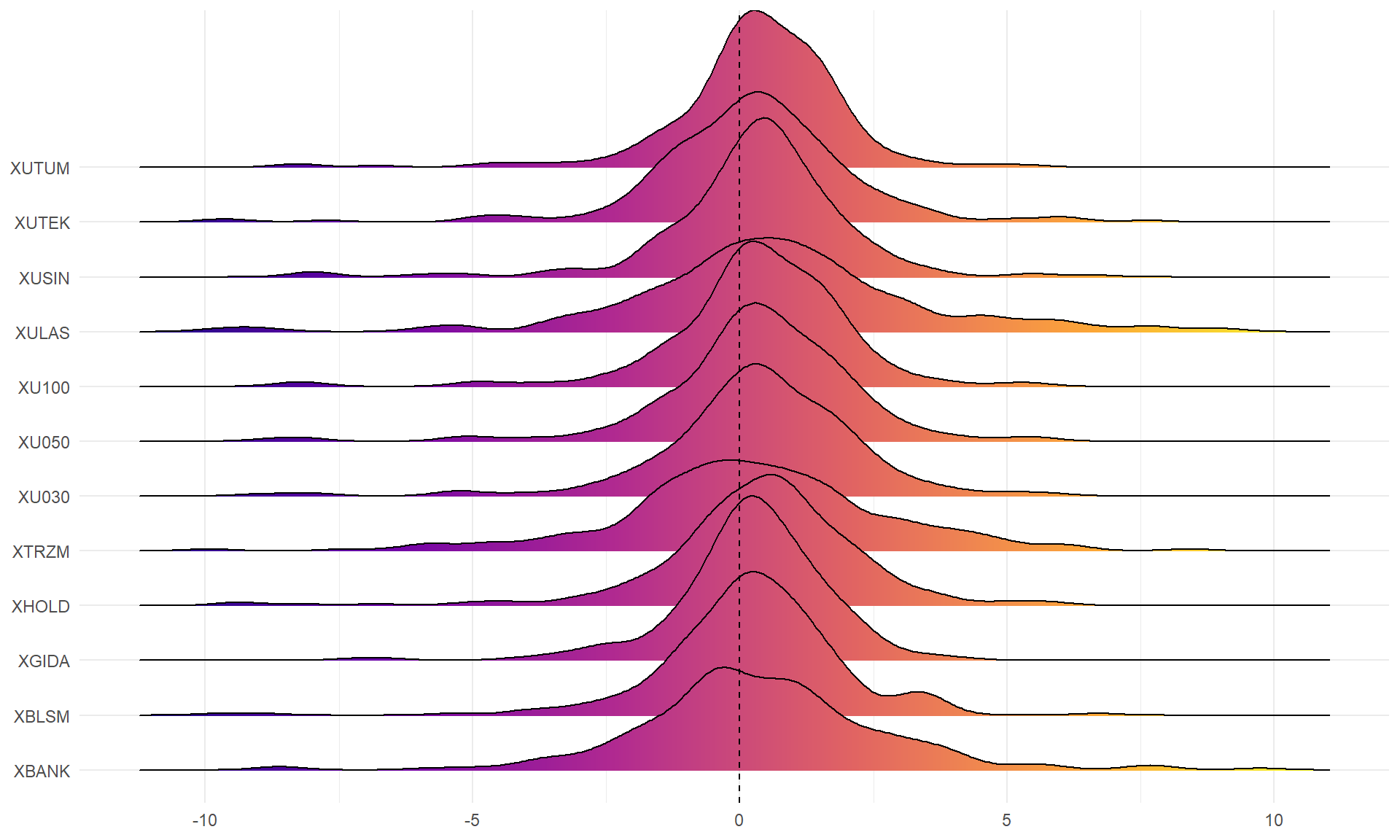
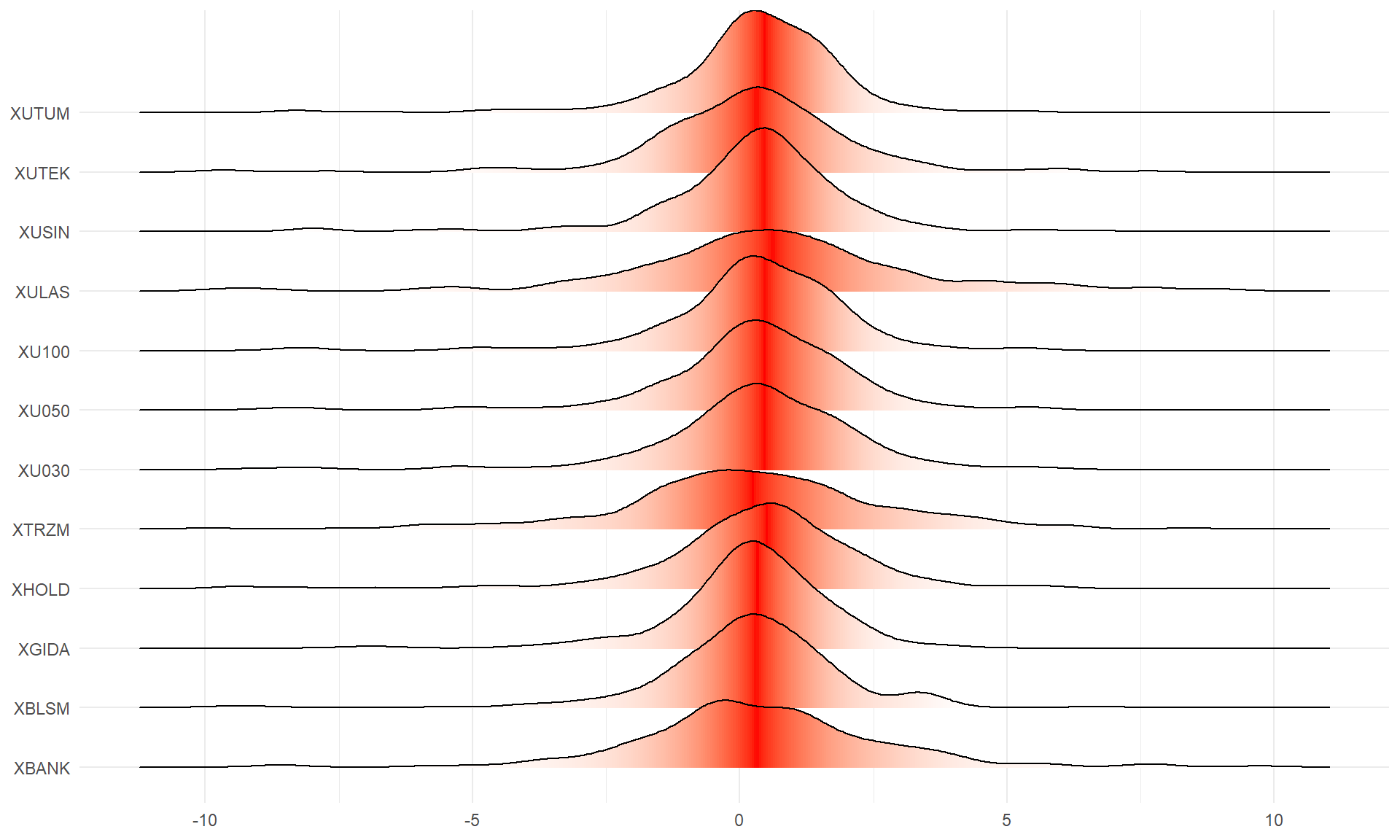
df %>%
  ggplot(aes(vals, y = vars, fill = 0.5 - abs(0.5 - stat(ecdf)))) +
  stat_density_ridges(geom = "density_ridges_gradient", calc_ecdf = TRUE) +
  scale_fill_gradient(low = "white", high = "red") +
  theme_minimal() +
  theme(axis.title = element_blank(),
        legend.position = "none")