Is there any value in visualizing data that you do not know? What is the value of visualizing the data we know in a bad way?
In this post, I would like to answer the two questions I asked above. I’m going to use TURKSTAT’s Consumer Confidence Index (CCI) data to answer my questions. TURKSTAT or Turkish Statistical Institute is an institution which is gathering and publishing national data of specific issues in different areas in Turkey. You can access the site by clicking the link here. If you encounter a Turkish page, you can change the TR abbreviation in the upper right corner to EN.
After clicking the link above, you can follow the steps below.
You can access the data (post19.xls) on my GitHub account.
Statistics
Economic Confidence
Statistical Tables
Consumer Confidence Index
4.1. Consumer Confidence Index, 2004-2011
4.2. Indices Concerning the Consumer Tendency and Monthly Changes
According to the definition in the metadata on TURKSTAT’s website, Monthly Consumer Tendency Survey aims to measure present situation assessments and future period expectations of consumers’ on personal financial standing and general economic course and determining consumers’ expenditure and saving tendencies for near future.
We know little about the data. Let’s import and visualize it.
library(tidyverse)

df <- readxl::read_excel("data.xls") %>%
  mutate(date = as.Date(date))

ggplot(df, aes(x = date, y = cons_conf_index)) +
  geom_line()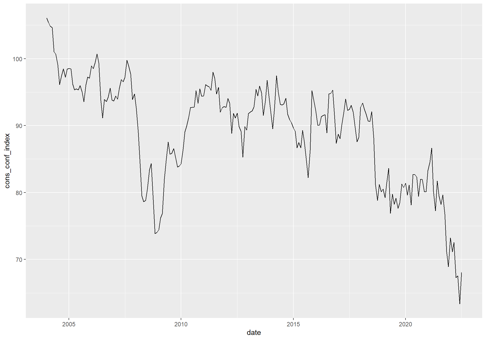
At first glance, we see a falling index, right? Yes, it’s true! We can add one more function, although it’s obvious that it’s falling.
ggplot(df, aes(x = date, y = cons_conf_index)) +
  geom_line() +
  geom_smooth(method = "lm") +
  geom_smooth(method = "loess")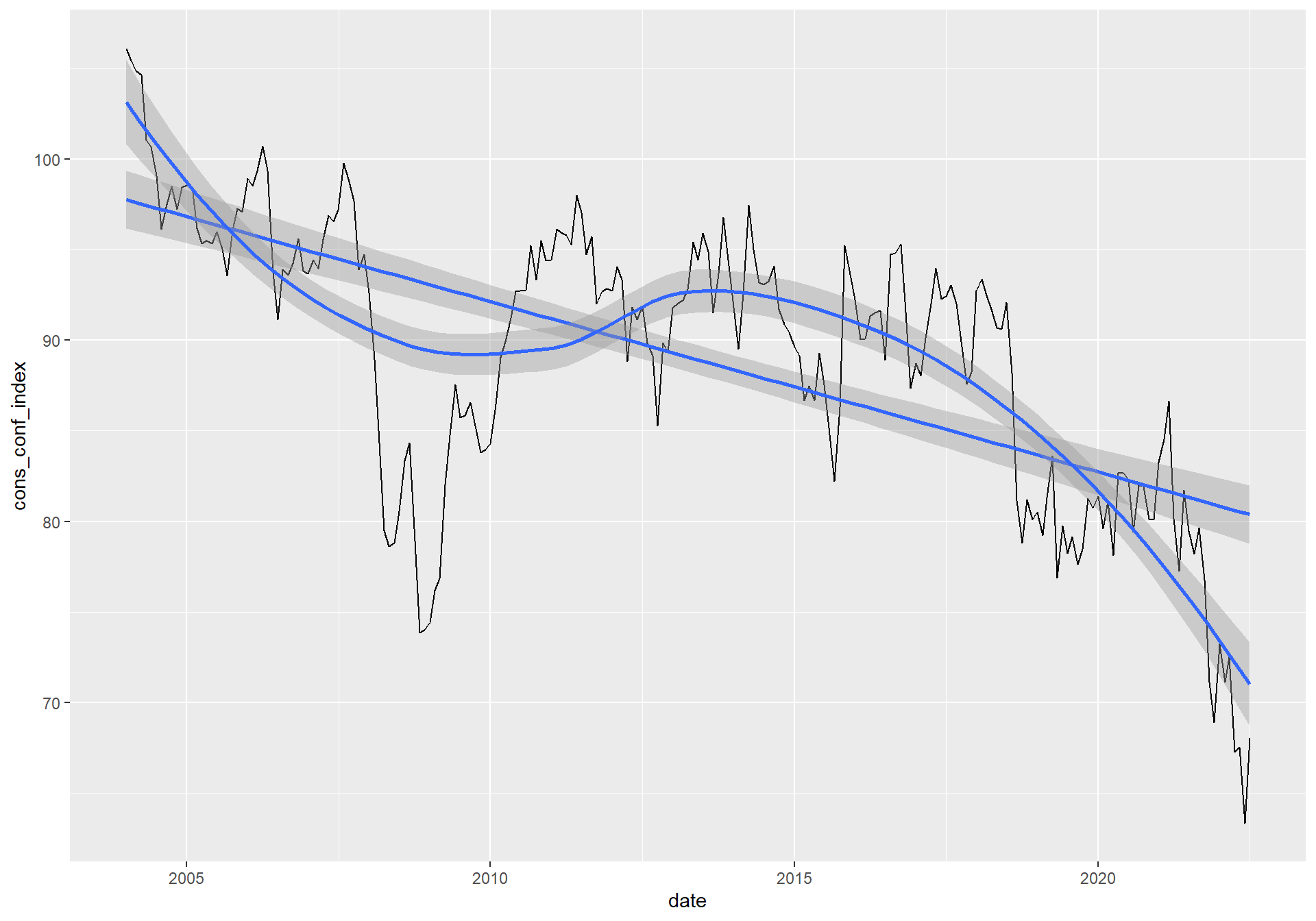
How about coloring it?
ggplot(df, aes(x = date, y = cons_conf_index)) +
  geom_line() +
  geom_smooth(method = "lm", color = "red") +
  geom_smooth(method = "loess", color = "blue")
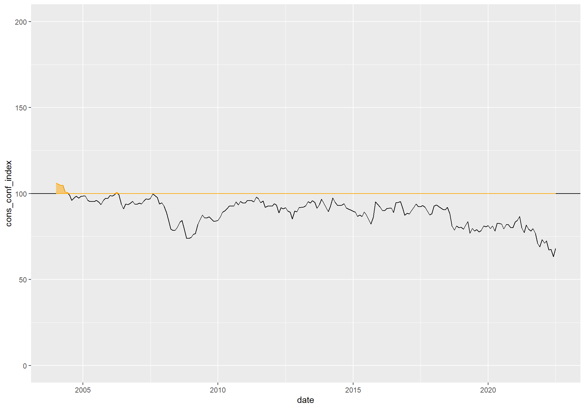
The main thing I want to draw your attention to is the y-axis values. A confidence level below 100 reflects a pessimistic outlook, while a reading above 100 indicates optimism.
Let’s redraw the graph taking into account the above information. I’m removing the function we added in the previous graph for now.
ggplot(df, aes(x = date, y = cons_conf_index)) +
  geom_line() +
  geom_hline(yintercept = 100)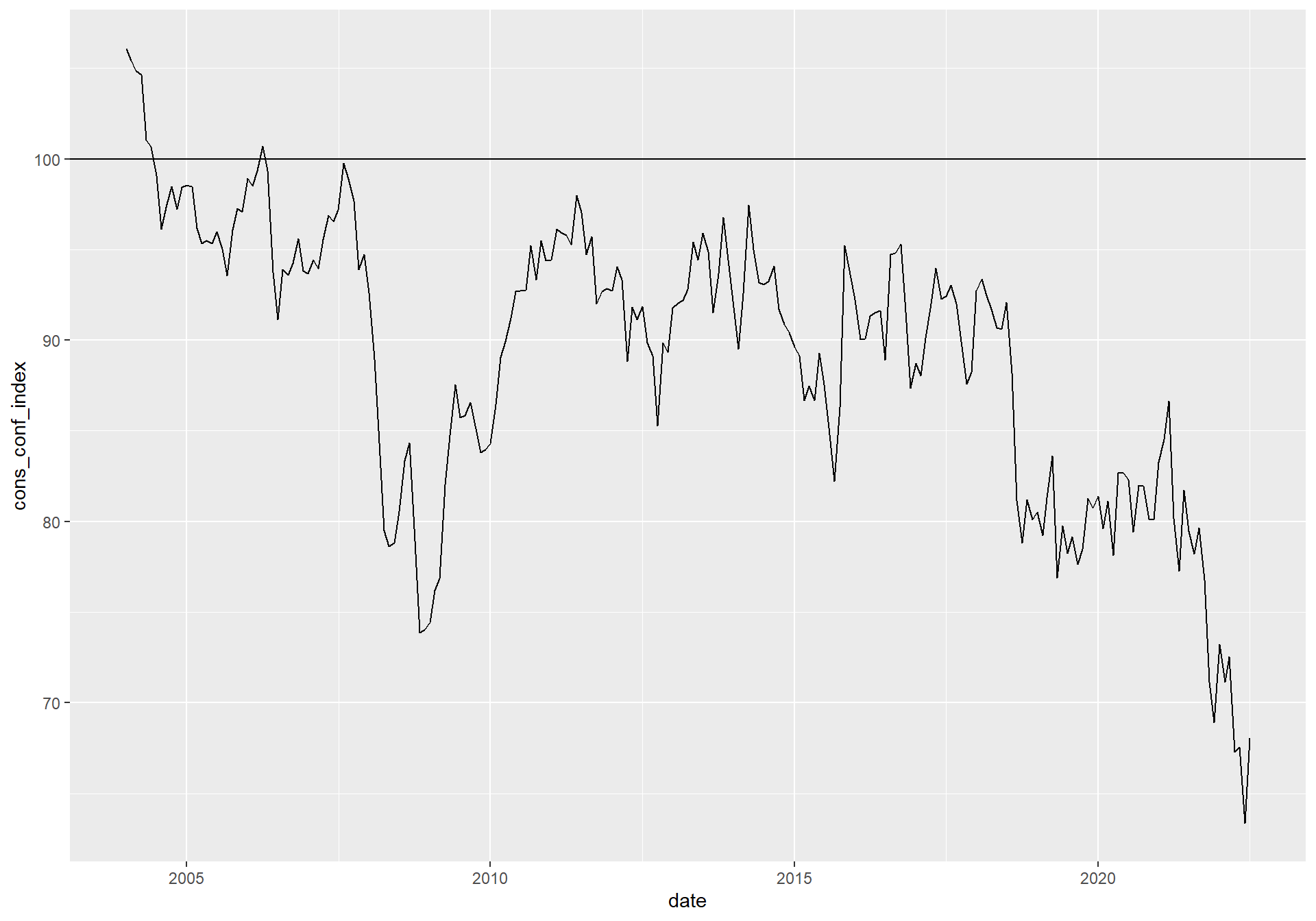
The consumers of Turkey have almost always been pessimistic!
Another piece of information is that the index is evaluated between 0 and 200.
ggplot(df, aes(x = date, y = cons_conf_index)) +
  geom_line() +
  geom_hline(yintercept = 100) +
  scale_y_continuous(limits = c(0,200))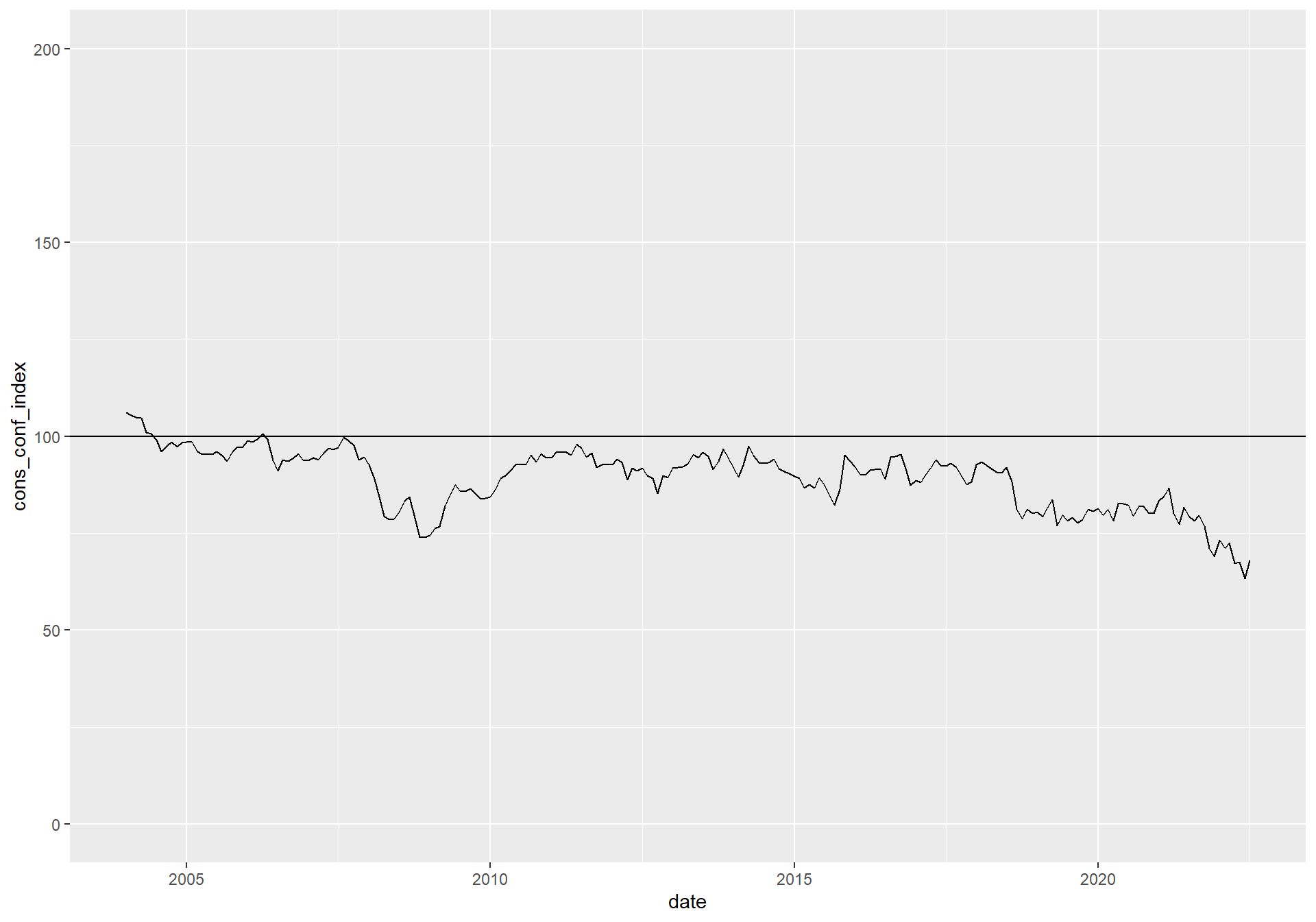
In the previous graphs, there was a perception that the index had reached its bottom point. Although the index is still bad, at least we have eliminated this perception.
I would like to show you step-by-step the ways to make a graphic more eye-catching, based on my experience.
I prefer the geom_ribbon() function when I need to color the above and below of a value. In our example, this value is 100.
First of all, I want to split the index values into two groups.
We splitted them into groups and we can use the geom_ribbon() function. Before making the graph, some values need to be created.
# Part - I

df$ymin_below <- pmin(df$cons_conf_index,100)
df$ymax_below <- 100

ggplot(df, aes(x = date, y = cons_conf_index)) +
  geom_line() +
  geom_hline(yintercept = 100) +
  scale_y_continuous(limits = c(0,200)) +
  geom_ribbon(
    aes(ymin = ymin_below, ymax = ymax_below),
    color = "red", #line
    fill = "red", #area
    alpha = .5 #transparency
  )
# Part - II

df$ymin_above <- 100
df$ymax_above <- pmax(df$cons_conf_index,100)

ggplot(df, aes(x = date, y = cons_conf_index)) +
  geom_line() +
  geom_hline(yintercept = 100) +
  scale_y_continuous(limits = c(0,200)) +
  geom_ribbon(
    aes(ymin = ymin_above, ymax = ymax_above),
    color = "orange", #line
    fill = "orange", #area
    alpha = .5 #transparency
  )
Combining two graphs into one…
ggplot(df, aes(x = date, y = cons_conf_index)) +
  geom_line() +
  #geom_hline(yintercept = 100) + ---> We don't need this line anymore
  scale_y_continuous(limits = c(0,200)) +
  geom_ribbon(
    aes(ymin = ymin_below, ymax = ymax_below),
    color = "red", #line
    fill = "red", #area
    alpha = .5 #transparency
  ) +
  geom_ribbon(
    aes(ymin = ymin_above, ymax = ymax_above),
    color = "orange", #line
    fill = "orange", #area
    alpha = .5 #transparency
  )
I’m one of those who like FiveThirtyEight’s theme! Use it to make it look good!
ggplot(df, aes(x = date, y = cons_conf_index)) +
  geom_line() +
  #geom_hline(yintercept = 100) + ---> We don't need this line anymore
  scale_y_continuous(limits = c(0,200)) +
  geom_ribbon(
    aes(ymin = ymin_below, ymax = ymax_below),
    color = "red", #line
    fill = "red", #area
    alpha = .5 #transparency
  ) +
  geom_ribbon(
    aes(ymin = ymin_above, ymax = ymax_above),
    color = "orange", #line
    fill = "orange", #area
    alpha = .5 #transparency
  ) +
  ggthemes::theme_fivethirtyeight()
A little more information?
ggplot(df, aes(x = date, y = cons_conf_index)) +
  geom_line() +
  #geom_hline(yintercept = 100) + ---> We don't need this line anymore
  scale_y_continuous(limits = c(0,200)) +
  geom_ribbon(
    aes(ymin = ymin_below, ymax = ymax_below),
    color = "red", #line
    fill = "red", #area
    alpha = .5 #transparency
  ) +
  geom_ribbon(
    aes(ymin = ymin_above, ymax = ymax_above),
    color = "orange", #line
    fill = "orange", #area
    alpha = .5 #transparency
  ) +
  ggthemes::theme_fivethirtyeight() +
  labs(
    title = "Turkish Consumer Confidence",
    subtitle = paste0(
      format(min(df$date),"%Y/%m"),
      "-",
      format(max(df$date),"%Y/%m")
    ), # To make it dynamic
    caption = "The data were collected from TURKSTAT"
  ) +
  theme(
    plot.subtitle = element_text(face = "italic", size = 10),
    plot.caption = element_text(face = "italic")
  )
In this post, I wanted to show you the importance of obtaining information about data and also showed you ways to visualize it better. I hope that you enjoyed reading and found this post helpful.