In the previous post, I shared a study using BIST-100 data and linear regression method. In this post, we are going to test the success of the method again using the same index.
As I mentioned before, we can get the data from the Electronic Data Delivery System of the Central Bank of the Republic of Turkey. Please check the previous post. You can also access the data (post18.xlsx) on my GitHub account.
In order to measure the success of the method, we are going to split the time series into a certain number of small series. Let me put it this way, data splitting is when data is divided into two or more subsets. Using the ntile() function to split the series is an option.
Assuming there are 4900 rows instead of 4914, we can split it into 49 different series. In this case, each series will have 100 observations.
After splitting the series, it’s time to build the model. If the data you have is grouped, you can make different models as shown below.
Let’s look at the first model as an example.
summary(df_models[[2]][[1]])
Call:
lm(formula = close ~ rn, data = .)

Residuals:
     Min       1Q   Median       3Q      Max
-18.2203  -2.9681   0.4508   4.2494  11.3862

Coefficients:
             Estimate Std. Error t value Pr(>|t|)
(Intercept) 105.42839    1.22710  85.917   <2e-16 ***
rn            0.03242    0.02110   1.537    0.128
---
Signif. codes:  0 '***' 0.001 '**' 0.01 '*' 0.05 '.' 0.1 ' ' 1

Residual standard error: 6.09 on 98 degrees of freedom
Multiple R-squared:  0.02354,   Adjusted R-squared:  0.01357
F-statistic: 2.362 on 1 and 98 DF,  p-value: 0.1275
We can get the fitted values and confidence intervals from the models we built as follows.
df_model_final <- data.frame()

for(i in unique(df$cluster)){

  df_filtered <- df %>%
    filter(cluster == i)

  df_filtered$fitted <- df_models[[2]][[i]][["fitted.values"]]
  df_filtered$lwr <- predict(df_models[[2]][[i]], interval = "prediction", level = 0.95)[,2]
  df_filtered$upr <- predict(df_models[[2]][[i]], interval = "prediction", level = 0.95)[,3]

  df_model_final <- df_model_final %>%
    bind_rows(df_filtered)

}
We are almost there!
df_model_final <- df_model_final %>%
  group_by(cluster) %>%
  mutate(rn = row_number())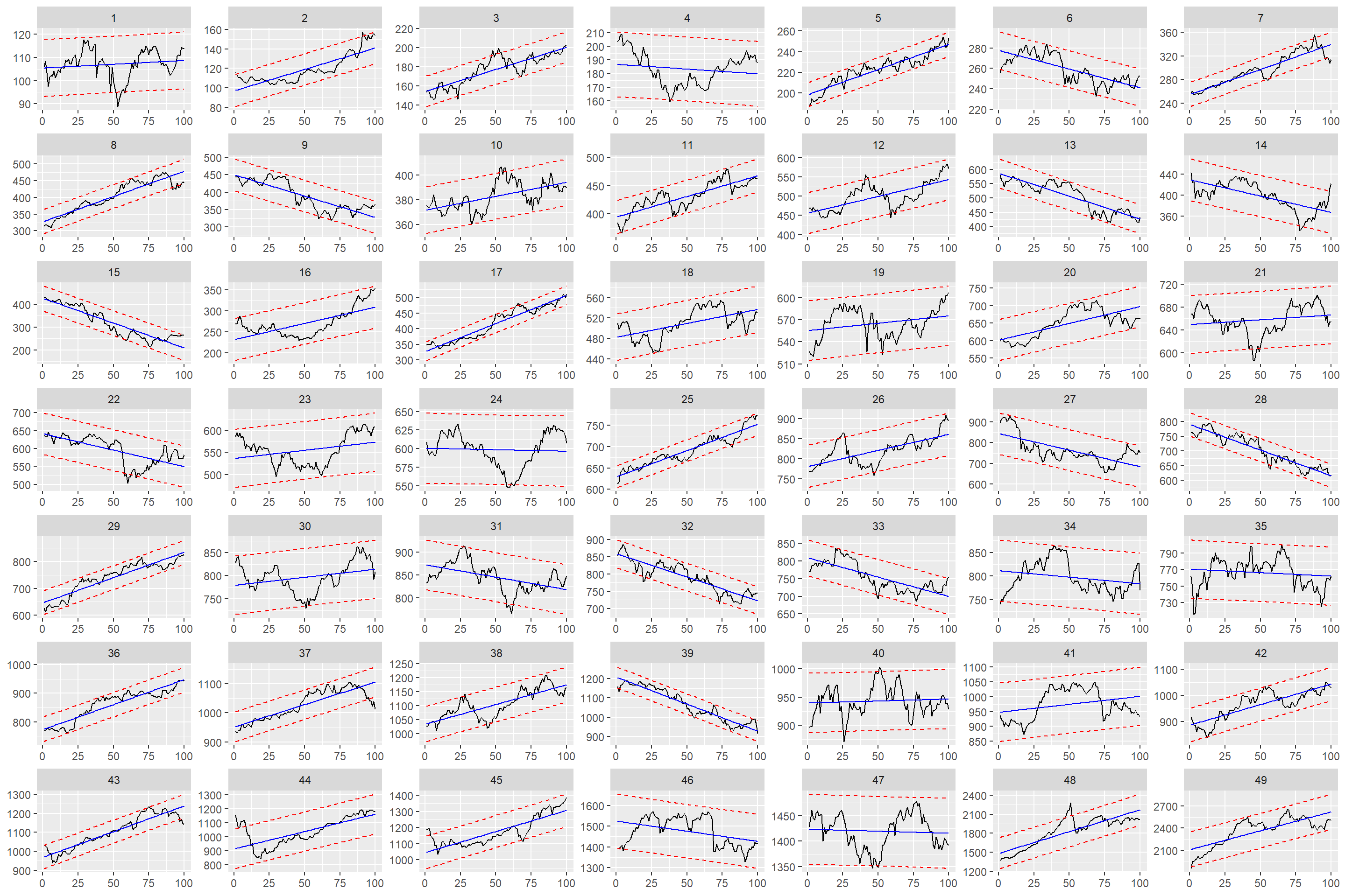
We’ve finished most of the work but need to brainstorm. How do we measure success? We can examine some series in a non-quantitative way under some assumptions. Maybe I can come up with different methods in the next posts.
Our assumption is to make a 100-day decision with a 100-day trend.
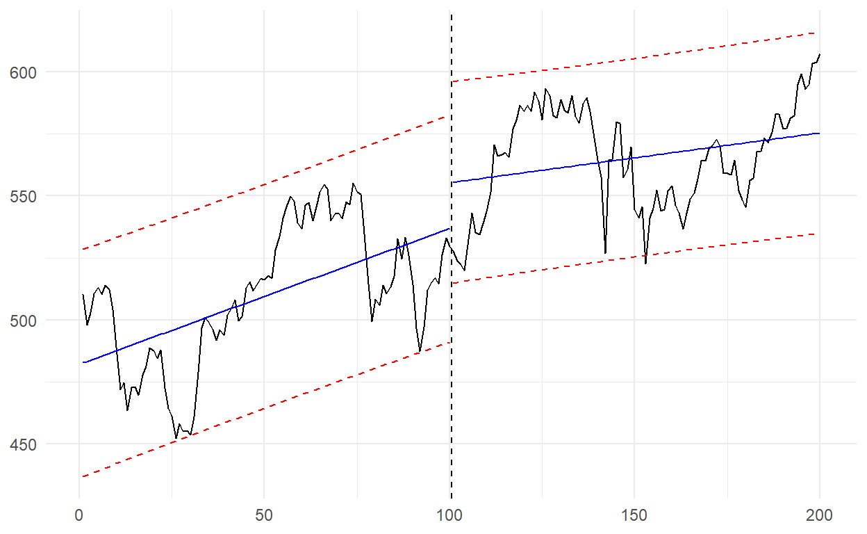
Let’s start with 2-3 and continue with 37-38.
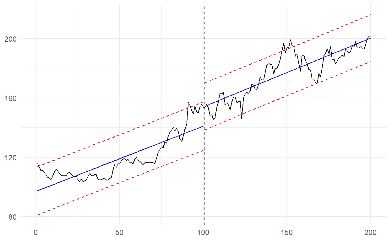
In the graph above, I could expect a drop from here as the index is in contact with the upper band. The index which was 153.81 became 201.85 after 100 days.

In the graph above, since the index is below the lower band, I could expect a rise from here. The index which was 1012.18 became 1165.10 after 100 days.
Some more graphs…
The index is actually close to the fitted line here. Most of the time it can be difficult to decide the direction around the fitted line, but there is a movement from the lower band here. Therefore, I could expect an upward movement. The index, which was 529.59, became 607.37 at the end of the series.
Well, based on the 49th series, what will be the situation for the 50th series we are currently in?
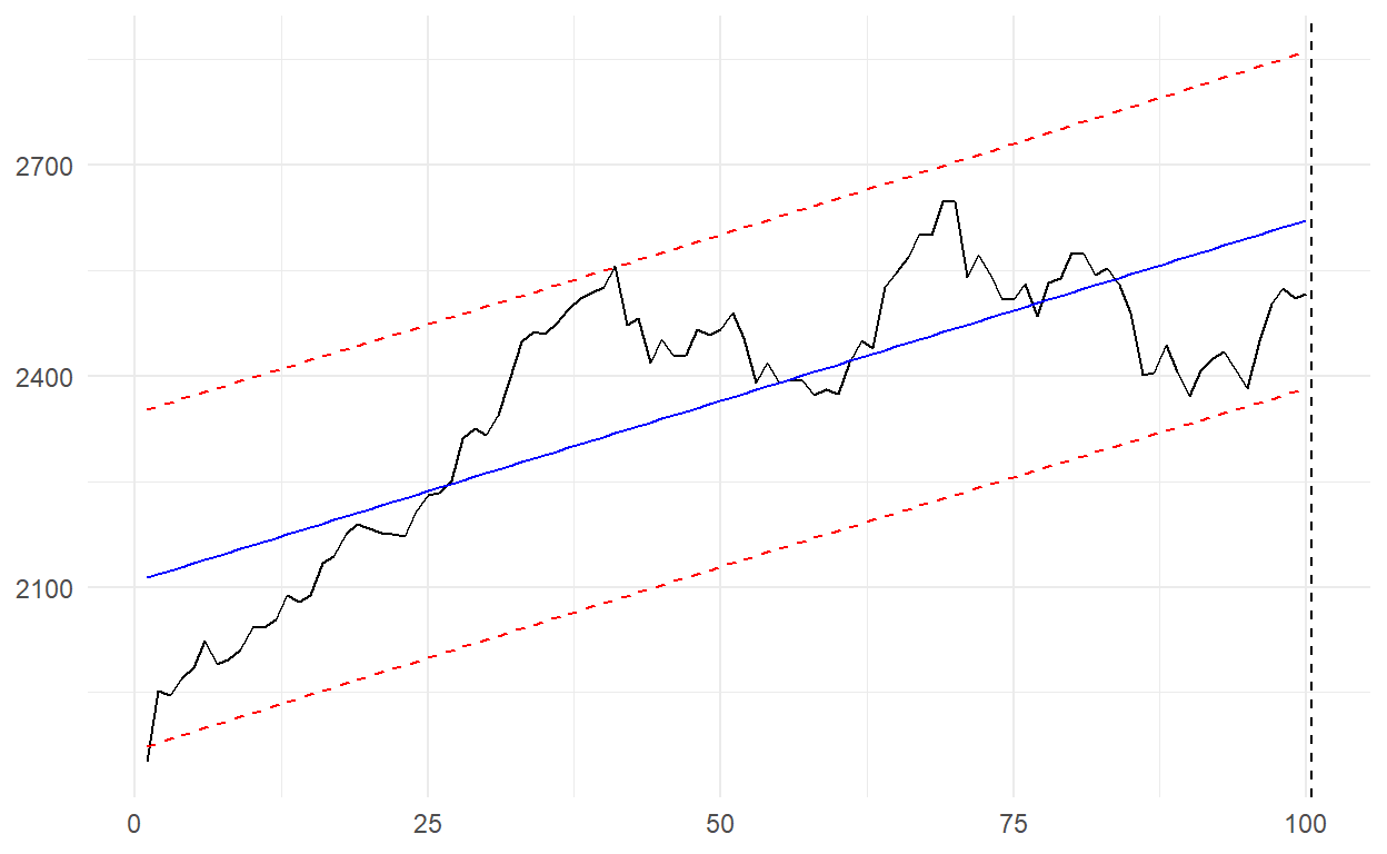
A movement of the series beginning from the lower band stands out. The index is still below the fitted line. An upward movement can be expected from here.
Bring back the 14 days we removed from the series earlier. When we add this, it becomes 114 days in total.

Perfect, just as we expected! In the coming days, we may see a trend break just like the other graphs!
Remember, we said: As can be seen from the graph, the real value is further away, which means that it is both moving away from the fitted value and in the overbought zone.
I should point out that we reached this conclusion from the monthly frequency series. In this study, we used daily frequency series. I mean, short-term rises can be expected, but it is necessary to pay attention to a possible bubble in longer term.
More is coming, stay tuned!
The codes of the graphics used in the study can be found below.
ggplot(df_model_final) +
  geom_line(aes(x = rn, y = close)) +
  geom_line(aes(x = rn, y = fitted), color = "blue") +
  geom_line(aes(x = rn, y = lwr), color = "red", linetype = "dashed") +
  geom_line(aes(x = rn, y = upr), color = "red", linetype = "dashed") +
  facet_wrap(~cluster, scales = "free") +
  theme(axis.title = element_blank())

ggplot(df_2_3) +
  geom_line(aes(x = t, y = close)) +
  geom_vline(xintercept = (100+101)/2, linetype = "dashed") +
  geom_line(aes(x = t, y = fitted, group = cluster), color = "blue") +
  geom_line(aes(x = t, y = lwr, group = cluster), color = "red", linetype = "dashed") +
  geom_line(aes(x = t, y = upr, group = cluster), color = "red", linetype = "dashed") +
  theme_minimal() +
  theme(axis.title = element_blank())

ggplot(df_37_38) +
  geom_line(aes(x = t, y = close)) +
  geom_vline(xintercept = (100+101)/2, linetype = "dashed") +
  geom_line(aes(x = t, y = fitted, group = cluster), color = "blue") +
  geom_line(aes(x = t, y = lwr, group = cluster), color = "red", linetype = "dashed") +
  geom_line(aes(x = t, y = upr, group = cluster), color = "red", linetype = "dashed") +
  theme_minimal() +
  theme(axis.title = element_blank())

ggplot(df_18_19) +
  geom_line(aes(x = t, y = close)) +
  geom_vline(xintercept = (100+101)/2, linetype = "dashed") +
  geom_line(aes(x = t, y = fitted, group = cluster), color = "blue") +
  geom_line(aes(x = t, y = lwr, group = cluster), color = "red", linetype = "dashed") +
  geom_line(aes(x = t, y = upr, group = cluster), color = "red", linetype = "dashed") +
  theme_minimal() +
  theme(axis.title = element_blank())

ggplot(df_49_50) +
  geom_line(aes(x = t, y = close)) +
  geom_vline(xintercept = (100+101)/2, linetype = "dashed") +
  geom_line(aes(x = t, y = fitted, group = cluster), color = "blue") +
  geom_line(aes(x = t, y = lwr, group = cluster), color = "red", linetype = "dashed") +
  geom_line(aes(x = t, y = upr, group = cluster), color = "red", linetype = "dashed") +
  theme_minimal() +
  theme(axis.title = element_blank())