Linear Regression is a method already used in technical analysis, but using existing methods as they are should not be a rule! So, we should always be open to different adventures. In this study, we will focus on a method that identifies both trend and overbought/oversold zones.
The data we are going to use are taken from the Electronic Data Delivery System of the Central Bank of the Republic of Turkey.
After clicking this link follow the steps shown below.
s1. Market Statistics
s2. Borsa Istanbul (BIST) Trading Volume (Thousand TRY, Thousand Unit)
s3. (PRICE INDICES) BIST-100 (XU100), According to Closing Price (January, 1986=0.01)
s4. Click the Add button
s5. Report Settings
s5.1. Frequency: Business
s5.2. Date From: 01-01-2003
s5.3. Date To: 01-08-2022
s5.4. Click the Create Report button
s5.5. The file can be downloaded by clicking the export button in the upper right corner
You can also access the data (post16.xlsx) on my GitHub account.
It may be a good idea to visualize before starting a study. You can find the codes related to visualization at the end of the post.
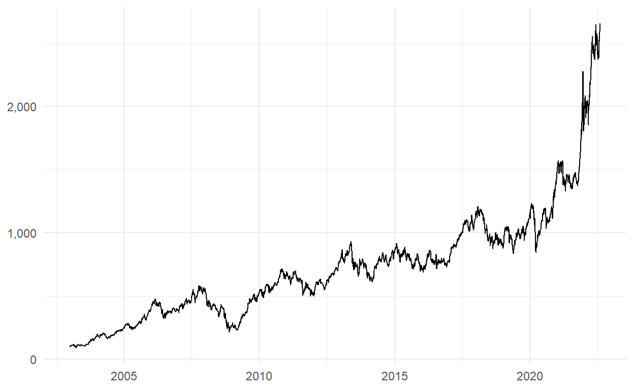
We can say that there is no problem with the data.
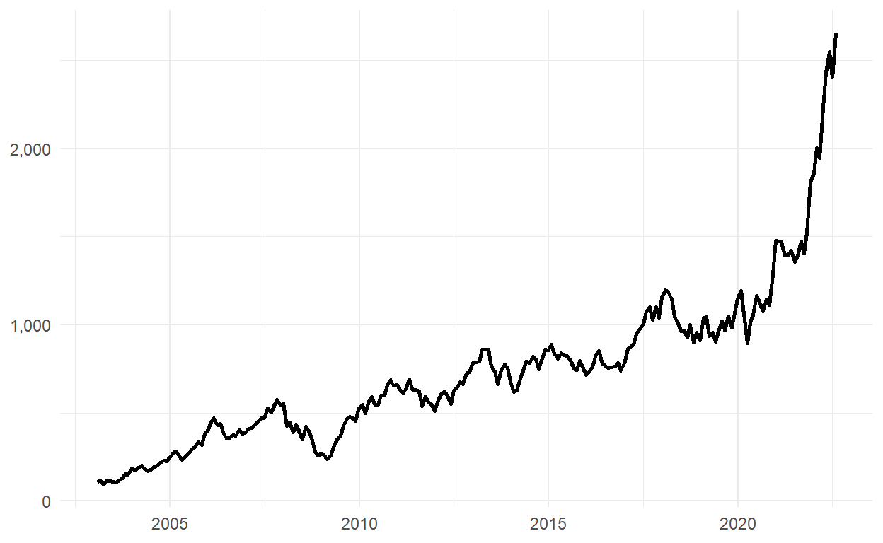
In the next part, we are going to use monthly data. Let’s extract the years and months from the date column.
After running the above code, we get the closing values at the end of the month as follows:
A data frame that can be used for monthly data has been created.
Monthly data are as follows:
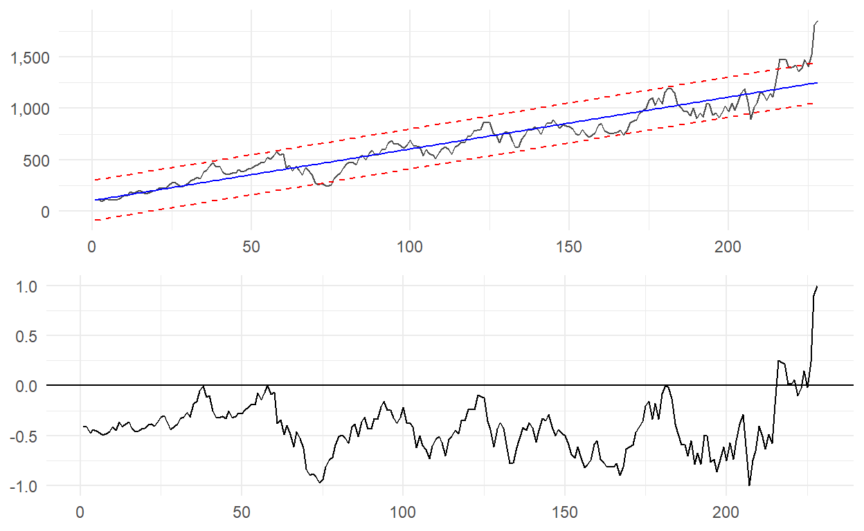
Let’s use the first 19 years from 2003 to 2019 and predict the remaining 1 year, but first let me explain the method we are going to use.
A Linear Regression model is created by fitting a trend line to a dataset where a linear relationship already exists.
===============================================
                        Dependent variable:
                    ---------------------------
                               xu100
-----------------------------------------------
t                            5.033***
                              (0.118)

Constant                    102.259***
                             (15.562)

-----------------------------------------------
Observations                    228
R2                             0.890
Adjusted R2                    0.889
Residual Std. Error     117.105 (df = 226)
F Statistic         1,824.293*** (df = 1; 226)
===============================================
Note:               *p<0.1; **p<0.05; ***p<0.01
And a prediction interval captures the uncertainty around a single value.
train_xu100_m$Fitted <- as.numeric(predict(model))

train_xu100_m$Lwr90 <- as.numeric(predict(model, interval = "predict", level = 0.9)[,2])
train_xu100_m$Upr90 <- as.numeric(predict(model, interval = "predict", level = 0.9)[,3])
Put them all together.

Some questions about the method.
How far are the actual values from the fitted values? If the distance is positive, it means that the actual values are above the fitted values.
train_xu100_m$ActualFitted <- train_xu100_m$xu100 - train_xu100_m$FittedHow far are the actual values from the upper band values? If the distance is positive, it means that the real values are above the upper band values, which is the overbought zone.
train_xu100_m$ActualUpr <- train_xu100_m$xu100 - train_xu100_m$Upr90How far are the actual values from the lower band values? If the distance is negative, it means that the real values are below the lower band values, which is the oversold zone. Notice that I multiplied the result by minus 1.
train_xu100_m$ActualLwr <- (train_xu100_m$xu100 - train_xu100_m$Lwr90)*(-1)It’s hard to understand the values we get. In such cases, values can be normalized. Here’s the formula for normalization:
\(x_{normalized} = \frac{(x - x_{minimum})}{(x_{maximum} - x_{minimum})}\)
In general, values are normalized to be between 0 and 1, but it is also possible to normalize it to be between -1 and 1.
\(x_{normalized} = 2*\frac{(x - x_{minimum})}{(x_{maximum} - x_{minimum})}-1\)

In the above graph, we expect the line to fluctuate around the zero line, but BIST-100 is far from it which tells us that we should consider a downward move.
In the graph above, which we created using the upper bands, the closeness to the 1 implies that it is in the overbought zone. We can interpret that BIST-100 is in this zone.

In the graph above, which we created using the lower bands, the closeness to the 1 implies that it is in the oversold zone. We can say that BIST-100 is far from the oversold zone.
We have 236 observations and we used 228 of them. Let’s try to predict the remaining 7 months (we didn’t include August) and see how far from the line we specified.
master1 <- train_xu100_m %>%
  select(3,2,4,5,6)

master2 <- data.frame(
  t = seq(nrow(master1)+1,nrow(df_xu100)-1,1),
  xu100 = df_xu100$xu100[c((nrow(master1)+1):(nrow(df_xu100)-1))]
)

master2$Fitted <- predict(model, newdata = data.frame(t = master2$t))
master2$Lwr90 <- predict(model, newdata = data.frame(t = master2$t),
                         interval = "prediction",
                         level = 0.9)[,2]
master2$Upr90 <- predict(model, newdata = data.frame(t = master2$t),
                         interval = "prediction",
                         level = 0.9)[,3]

master <- rbind(master1,master2)
As can be seen from the graph, the real value is further away, which means that it is both moving away from the fitted value and in the overbought zone.
My in-depth studies will continue here :)
The codes of the graphics used in the study can be found below.
ggplot(df_xu100, aes(x = date, y = xu100)) +
  geom_line() +
  theme_minimal() +
  theme(axis.title = element_blank()) +
  scale_y_continuous(labels = scales::comma)

ggplot(xu100_m, aes(x = date, y = xu100)) +
  geom_line(size = 1) +
  theme_minimal() +
  theme(axis.title = element_blank()) +
  scale_y_continuous(labels = scales::comma)

ggplot(train_xu100_m, aes(x = t)) +
  geom_line(aes(y = xu100), color = "gray30") +
  geom_line(aes(y = Fitted), color = "blue") +
  geom_line(aes(y = Lwr90), color = "red", linetype = "dashed") +
  geom_line(aes(y = Upr90), color = "red", linetype = "dashed") +
  theme_minimal() +
  theme(axis.title = element_blank()) +
  scale_y_continuous(labels = scales::comma) -> g1

ggplot(train_xu100_m, aes(x = t)) +
  geom_line(aes(y = ActualFitted)) +
  geom_hline(yintercept = 0) +
  theme_minimal() +
  theme(axis.title = element_blank()) -> g2

gridExtra::grid.arrange(g1,g2)

ggplot(train_xu100_m, aes(x = t)) +
  geom_line(aes(y = ActualUpr)) +
  geom_hline(yintercept = 0) +
  theme_minimal() +
  theme(axis.title = element_blank()) -> g3

gridExtra::grid.arrange(g1,g3)

ggplot(train_xu100_m, aes(x = t)) +
  geom_line(aes(y = ActualLwr)) +
  geom_hline(yintercept = 0) +
  theme_minimal() +
  theme(axis.title = element_blank()) -> g4

gridExtra::grid.arrange(g1,g4)

ggplot(master, aes(x = t)) +
  geom_line(aes(y = xu100), color = "gray30") +
  geom_line(aes(y = Fitted), color = "blue") +
  geom_line(aes(y = Lwr90), color = "red", linetype = "dashed") +
  geom_line(aes(y = Upr90), color = "red", linetype = "dashed") +
  geom_vline(xintercept = nrow(master1)+1, linetype = "dashed") +
  theme_minimal() +
  theme(axis.title = element_blank(),
        plot.title = element_text(face = "bold", size = 15)) +
  scale_y_continuous(labels = scales::comma) +
  labs(
    title = "BIST-100 Monthly",
    subtitle = "Is it in the overbought zone?"
  )